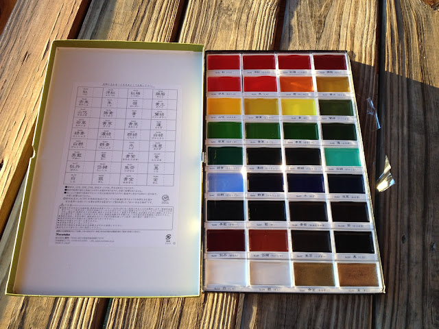
I did these pieces awhile back, and wanted to wait to post it until I'd finished the set, but unfortunately, the originals and the watercolor book they reside in got lost, and rather than wait, I decided I'd go ahead and post the first three now. If you're interested in the sort of watercolor supplies I work with, I did a post awhile back about that
here, and there's only been a few changes to my supplies.
 |
| I begin with an image transfer. I've prepared a sheet of regular printing paper by coating the back with graphite. I then cut the image I want out, and tape it down using low-tack blue painter's tape. |
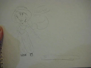 |
| Once the image is transferred, I tighten it up a little. I'm not really concerned with the graphite showing through. |
 |
| I begin with the skintone. Paint always dries lighter than when it's applied, so unfortunately, my Jasmin ended up a little on the light side. My apologies, I'm still learning how to manipulate the medium. |
 |
| After the first application of skintone dried, I added another. I like working in subsequent layers to build up shadows and tone. |
 |
| As the shadows progressively grow darker, I add a little red to the apples of her cheeks. |
 |
| Next comes the blue of her outfit. Again, I start out very light, and progressively add layers. |
 |
| Her black hair isn't a true black, it's a blue black |
 |
| Golds are actually fairly hard for me to render, but at least with watercolor, it's fairly easy to scrub it out. |
 |
| I add highlights with white gouache. |
 |
| And details with brown and black gouache. I'm sorry this photo is so blurry, I wish I could post a scan of the original. |
 |
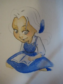
| I proceeded with Belle in much the same way. |


Your process posts are always so detailed and nice! The greenish outline on Ariel's lower body was a very nice touch.
ReplyDeleteAlso, thanks for the link back to your post on watercolor supplies. I only have one palette of different colors (similar to one of your travel sets), and your post has inspired me to make a color swatch. It should make mixing colors a bit more predictable, right?