Advanced Inking Techniques- Inking Assignment #3- Combination of Brush and Nib
The parameters for this assignment were slightly different from the previous two (links) advanced inking assignments. Those assignments restricted us to one tool- either brush or nib, but not both, and required us to combine the two, which was a relief for me, as I like the delicacy of nib but the immediacy of brush. We were advised to spend about three and a half hours on these, with thirty minutes allocated to sketching, but I've found that I do poor work sans reference when I don't flesh out my sketches, so I didn't rush the sketching stage. The average for these ink renders were 9 hours, with the shortest (the last) taking maybe six. This surplus of time stems partially from learning to effectively combine the two tools to achieve the look I want, but it also comes from the fact that I completed all three of these while attending Anime South East in Tennessee, and additional time was acquired hobbling to and from panels, seeing to customers, and accommodating some pretty abysmal working conditions.
I'm not completely pleased with any of these, probably because so much time was invested and I can see so many errors this soon after completion. The honeymoon phase between myself and my work is short, sometimes non-existent, and I have a tendency to be hyper critical. If I were to pick a favorite, it would be the middle one, as I feel the storytelling is the strongest. My least favorite was done first- the topmost, I feel the storytelling is the weakest. There's another reason why I'm sinking so much time into pieces like these- I currently don't have a library of prints to draw from for conventions, and prints seem to be big sellers. Not only am I trying to learn as much as possible from this inking class, but I'm hoping to remedy my print situation.
This first piece was inspired by Evening Dresses, a huge coffee table book I ordered from Gilt awhile back. You guys may have noticed that I tend to use that book for the 'costuming' requirement in the past two assignments. I really have a soft spot for fashion and shoujo, and that book seems to fill that need. It's full of fantastic photographs and fashion sketches, and I found these two dresses in it. The first woman's pose and appearance is based directly on the pose of the model in the book (with the addition of the mask), but the second woman's pose and appearance were designed to suit and soften her partner. Although these dresses were not shown together in the book itself, I felt there were enough similarities to force a theme upon this piece, which extends to the starry background. The dots on the dress to the left were applied with a stippling technique that included application of Copic Opaque White (watered down a bit) using a G nib. The majority of the nib work was done using a Tachikawa Manga tank nib, and the entirety of the brushwork was done with a Winsor Newton Series 7 in a size 2.
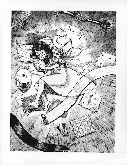
 This second piece was based off a thumbnail I did awhile back. I'm trying to do as much concept work for Kara as I can in this inking class, and I feel like all of it needs to have strong storytelling so the pieces can function on their own. Every 7" Kara illustration (including the two figures from imagination done in prior assignments) has clues to let the viewer know the scale of the Lilliputians and I always try to push the atmospheric lighting as much as possible. This illustration shows Kara asleep in a sewing box, surrounded by sewing notions, which reflects my own love of sewing. Her accessories are strongly based on those I've owned in the past (not that a tomato pincushion is uncommon at all) and I've included tiny quilting squares for visual interest. As before, the majority of the nib work was done using a Tachikawa Manga tank style nib and a Winsor Newton Series 7, but much of the dry brushwork was done with a Cotman watercolor brush loaned to me by Heidi, so I wouldn't ruin my Winsor Newton.
 Believe it or not, I am a huge fan of both cheesecake and pinups, but only if the participants are actively engaged in the process. I love cheeky pinup models, but I rarely get a chance to draw them. This final piece provided a perfect opportunity for just that, and allowed me to experiment with framing and composition. There are a lot of elements I would tweak (her lips for example, are the sad necessity of my ink resisting over the Opaque White, and me having to settle for second best) and I think the strawberries came out lumpy and kinda gross looking, but overall, I'm pleased with the piece.
 For someone who hates drybrush, I've been relying on it a lot lately, especially for hatching. I'm a huge fan of nib hatching, but my nibs have become unreliable (it's my heavy hand) and don't always work properly even after a good cleaning. I'm becoming a bit more adept at handling a brush, although I still don't trust myself to ink faces with it when given the choice.
A major problem I'm having is that the ink I use does not want to work when applied over Copic Opaque White (the current correctional fluid I'm using). I've had similar problems with Ph Martin's Bleedproof White, and I've given both enough time to dry. The ink application has a wax resist effect, even when applied with a brush. Have any of you had similar problems with this? Any suggestions?
I'm not completely pleased with any of these, probably because so much time was invested and I can see so many errors this soon after completion. The honeymoon phase between myself and my work is short, sometimes non-existent, and I have a tendency to be hyper critical. If I were to pick a favorite, it would be the middle one, as I feel the storytelling is the strongest. My least favorite was done first- the topmost, I feel the storytelling is the weakest. There's another reason why I'm sinking so much time into pieces like these- I currently don't have a library of prints to draw from for conventions, and prints seem to be big sellers. Not only am I trying to learn as much as possible from this inking class, but I'm hoping to remedy my print situation.
This first piece was inspired by Evening Dresses, a huge coffee table book I ordered from Gilt awhile back. You guys may have noticed that I tend to use that book for the 'costuming' requirement in the past two assignments. I really have a soft spot for fashion and shoujo, and that book seems to fill that need. It's full of fantastic photographs and fashion sketches, and I found these two dresses in it. The first woman's pose and appearance is based directly on the pose of the model in the book (with the addition of the mask), but the second woman's pose and appearance were designed to suit and soften her partner. Although these dresses were not shown together in the book itself, I felt there were enough similarities to force a theme upon this piece, which extends to the starry background. The dots on the dress to the left were applied with a stippling technique that included application of Copic Opaque White (watered down a bit) using a G nib. The majority of the nib work was done using a Tachikawa Manga tank nib, and the entirety of the brushwork was done with a Winsor Newton Series 7 in a size 2.


A major problem I'm having is that the ink I use does not want to work when applied over Copic Opaque White (the current correctional fluid I'm using). I've had similar problems with Ph Martin's Bleedproof White, and I've given both enough time to dry. The ink application has a wax resist effect, even when applied with a brush. Have any of you had similar problems with this? Any suggestions?
I use a Bic Wite-Out Correction Pen and as long as I let it dry and don't draw really hard over it (which would scratch it up), it turns out great. I never even notice it is there on the end result except that it doesn't quite match the paper, but it is close enough that it disappears when digitized. I have used sumi ink and Speedball India ink over it with fine results.
ReplyDelete