Copic Tutorial- Skin Basics, Freckles, Hair, Clothes
Basic Tips Before We Get Started
Copics are a bit of a fetish for many illustrators, particularly illustrators who have been strongly influenced by anime and manga, but they aren't the end all be all of alcohol based markers. I've written about several other brands over the years, and while I have a sizable collection of Copic sketch markers, I also have Shin Han Twin Touch markers, Blick Studio Brush markers, and several Prismacolors. Many marker brands are intermixable- so long as you're buying alcohol based markers, not water or xylene based, your markers will more or less work together.
Most artists who use Copics and other alcohol based markers for illustration prefer brush tipped markers like Copic Sketch and Ciao, Prismacolor Premier, Letraset Flex, and Blick Studio Brush markers. While you CAN use bullet nib alcohol based markers, those make it a lot harder to get even coverage, and it takes a lot longer to color. Cheaper marker brands, like Finecolour, Artist's Loft, and Hobby Lobby's alcohol based markers only come with a bullet nib option, and may be so annoying to use that you feel alcohol based markers aren't for you. Before you fully decide, I recommend you pick up a few brush tipped alcohol based markers in the same color family (like three Prismacolor Premier markers in the green family) and play around with those on nice cardstock before you fully decide to give up on alcohol based markers.
A general rule of thumb is cheaper brands, like Finecolour or even Blick Studio Brush, will have less color saturation in the dyes used for markers. Saturation can be built up by layering, but they will never be as saturated as Copic or Prismacolor inks.
Prismacolor makes certain colors that Copic doesn't, so if you are having trouble finding a color in the Copic family, check Prismacolor. Prisma excels at bright, saturated colors- intense yellows, hot red violets, and fluorescents.
I recommend that you check out my Holiday Gift Guide on markers for the aspiring artist if you're looking for color suggestions and brand recommendations. I also have a video that features my three favorite non-Copic brands below.
3 Cheap Copic Marker Alternatives
But If You Have to Have Copics
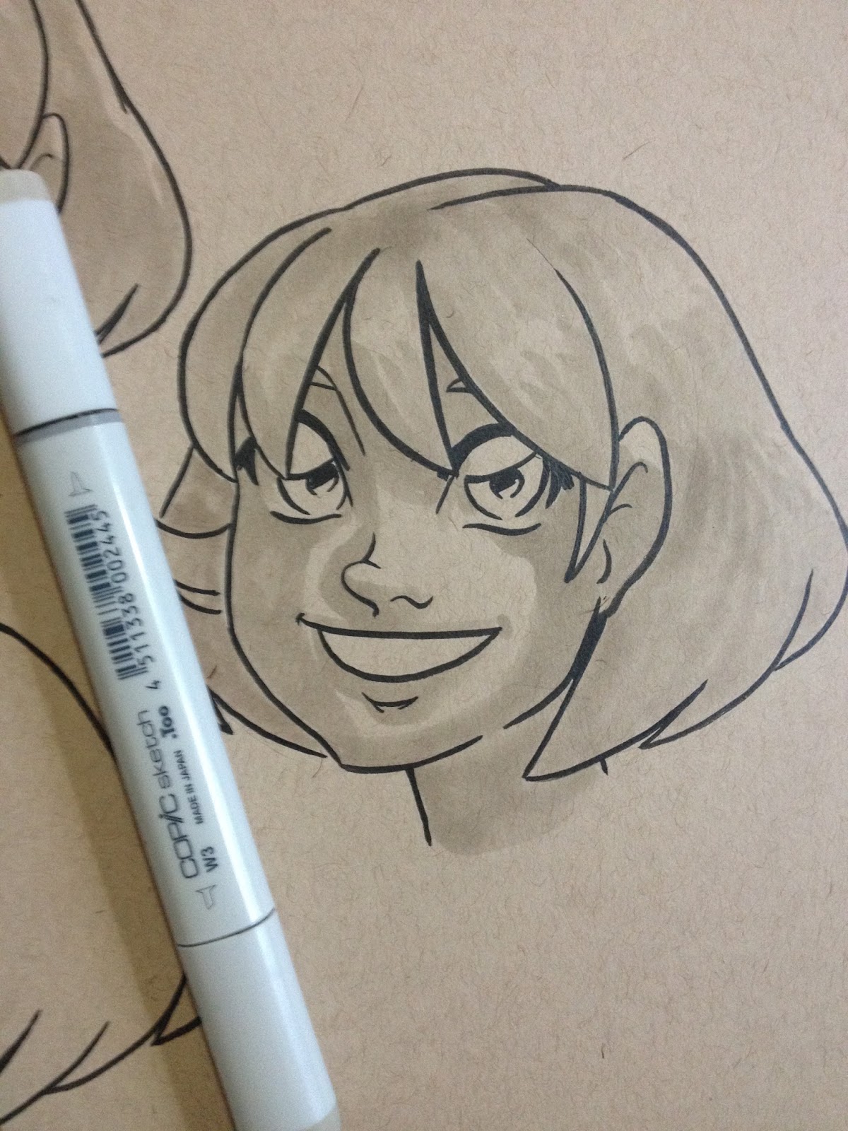
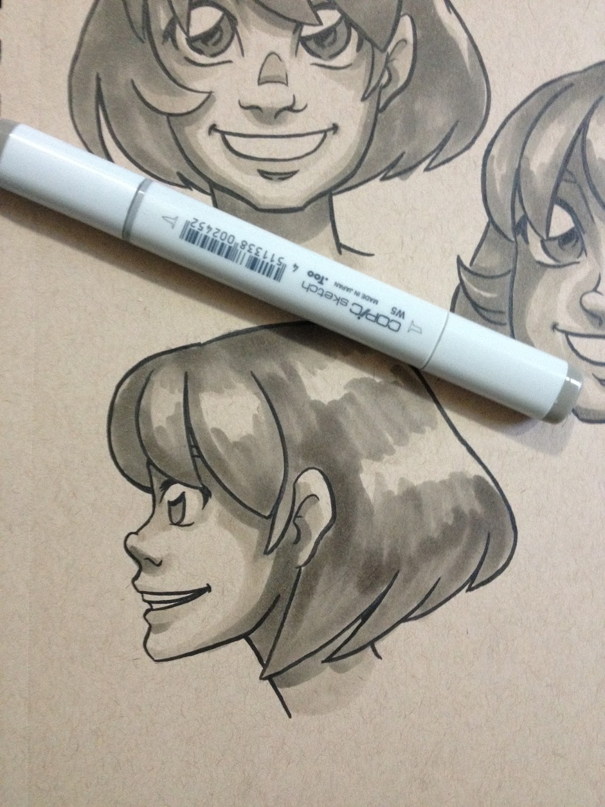
Focus on buying a set of Warm Grays and amassing a collection of skintones that work for the type of work you want to do.
Your markers can do double or even triple duty through layering! The first layer of a color is very light, and often a bit streaky, but the second and third are much darker and saturated. While you build up your marker collection, keep in mind that layering can make just a handful of markers work wonders.

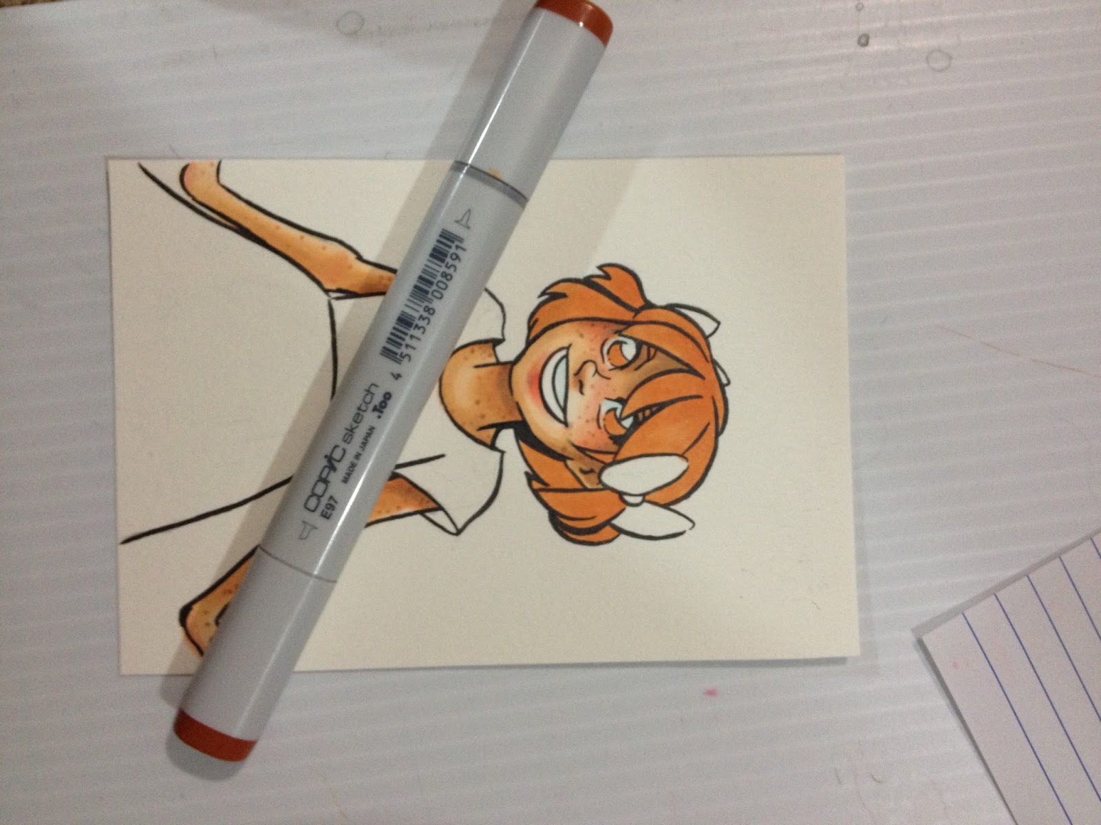
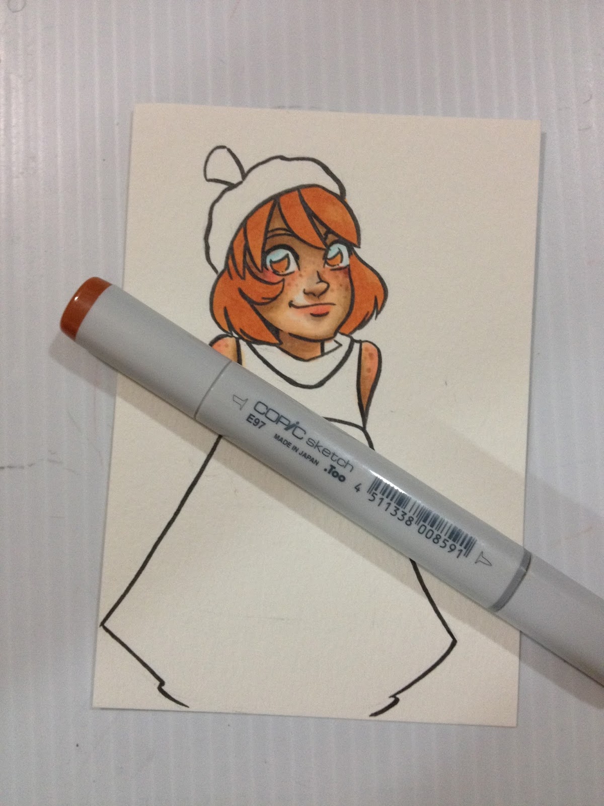
Two layers of E97 have been applied to Kara's hair.

As you can see, the first layer is much lighter than the second.
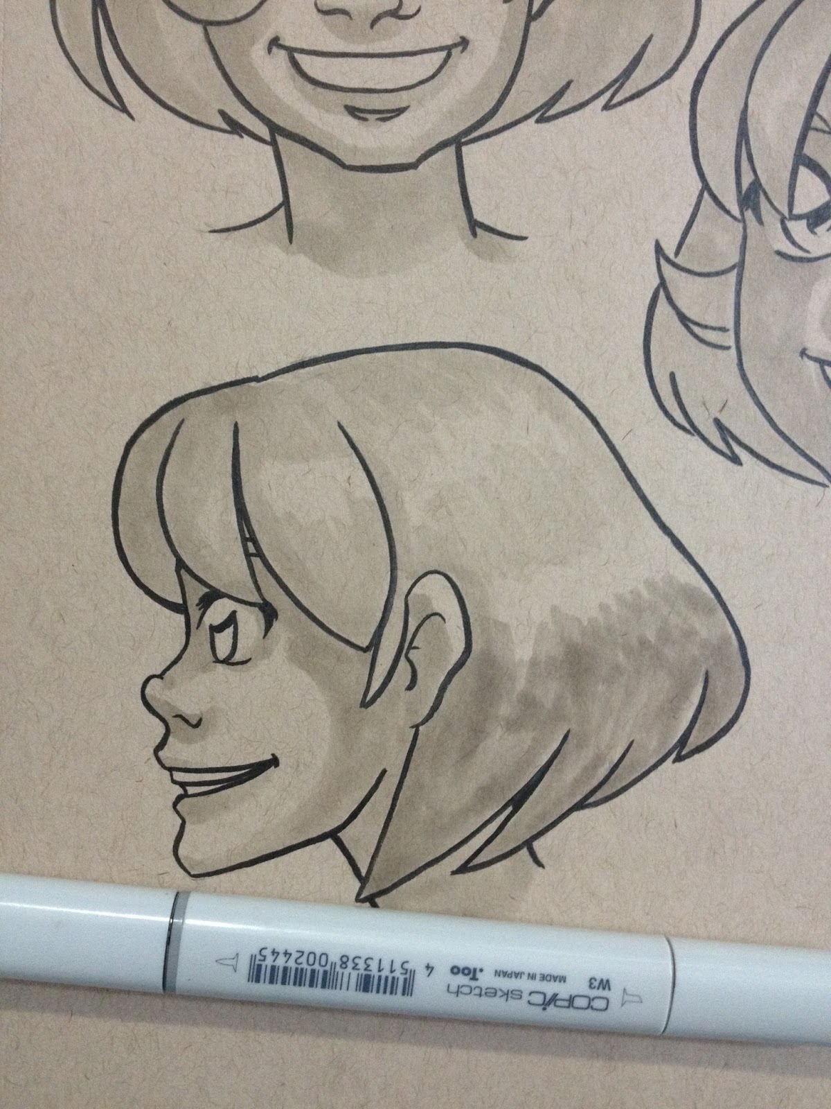
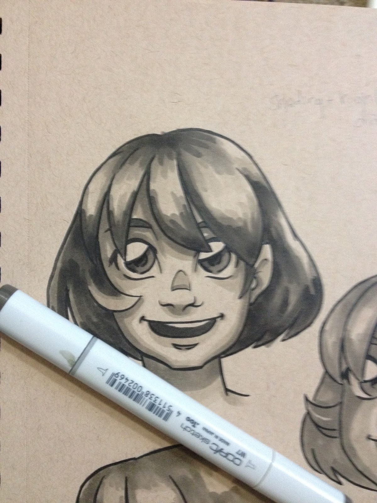
While you're still building that collection, consider keeping your pieces as tonal studies, or tonal studies with a single color highlight. Colored paper, like Strathmore's Toned Tan and Toned Gray, give you an additional color- the color of the paper, and if you use white color pencil, that's two more colors.
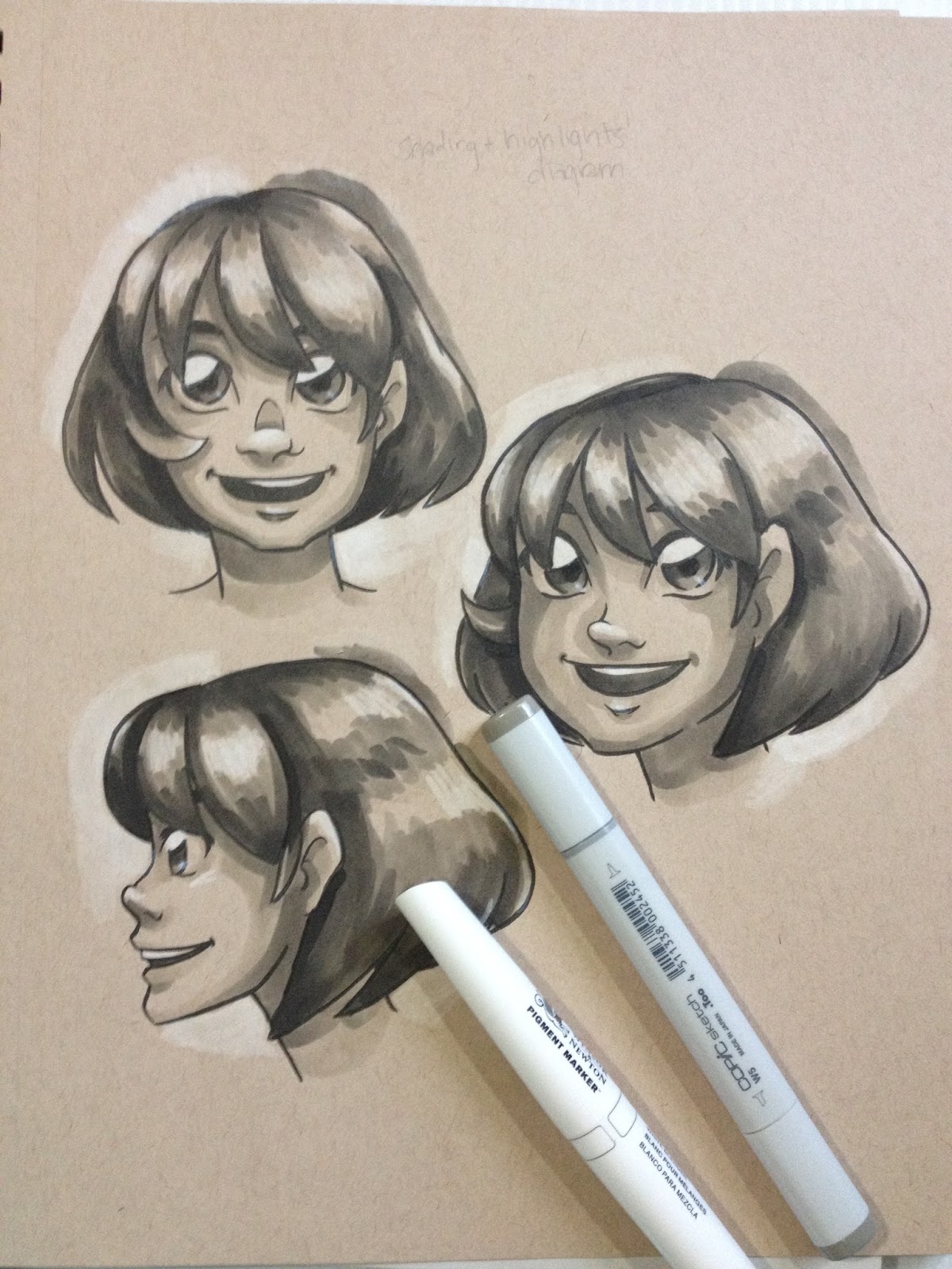
Determining where your shadows go


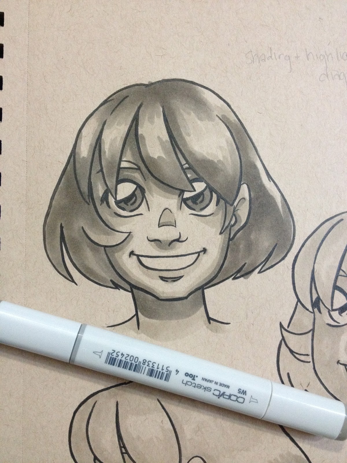
After I've applied my first round of shadows, and put in my initial applications of blush, I go in and intensify my shadows with E51, as demonstrated below with these tonal studies.


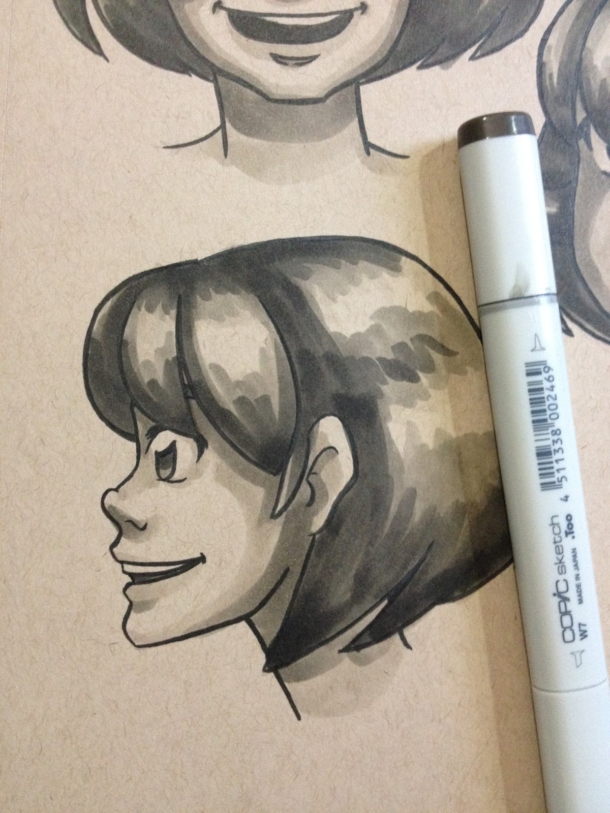
At this stage, I may add in shadows with E21, or I may put in my contrasting shadows with BV000 or BV31, depending on the image. The contrasting shadows should be applied sparingly, as they will REALLY gray out your skintone. I find they work best under bangs, inside ears, under chin, and where clothing casts shadow. If you apply a layer of E51 or E21 on top, it will warm the shadows up a little bit, but the cast shadows wont have a strong a delineation. I've demonstrated shadows put in by E21 or BV colors with the tonal study below.


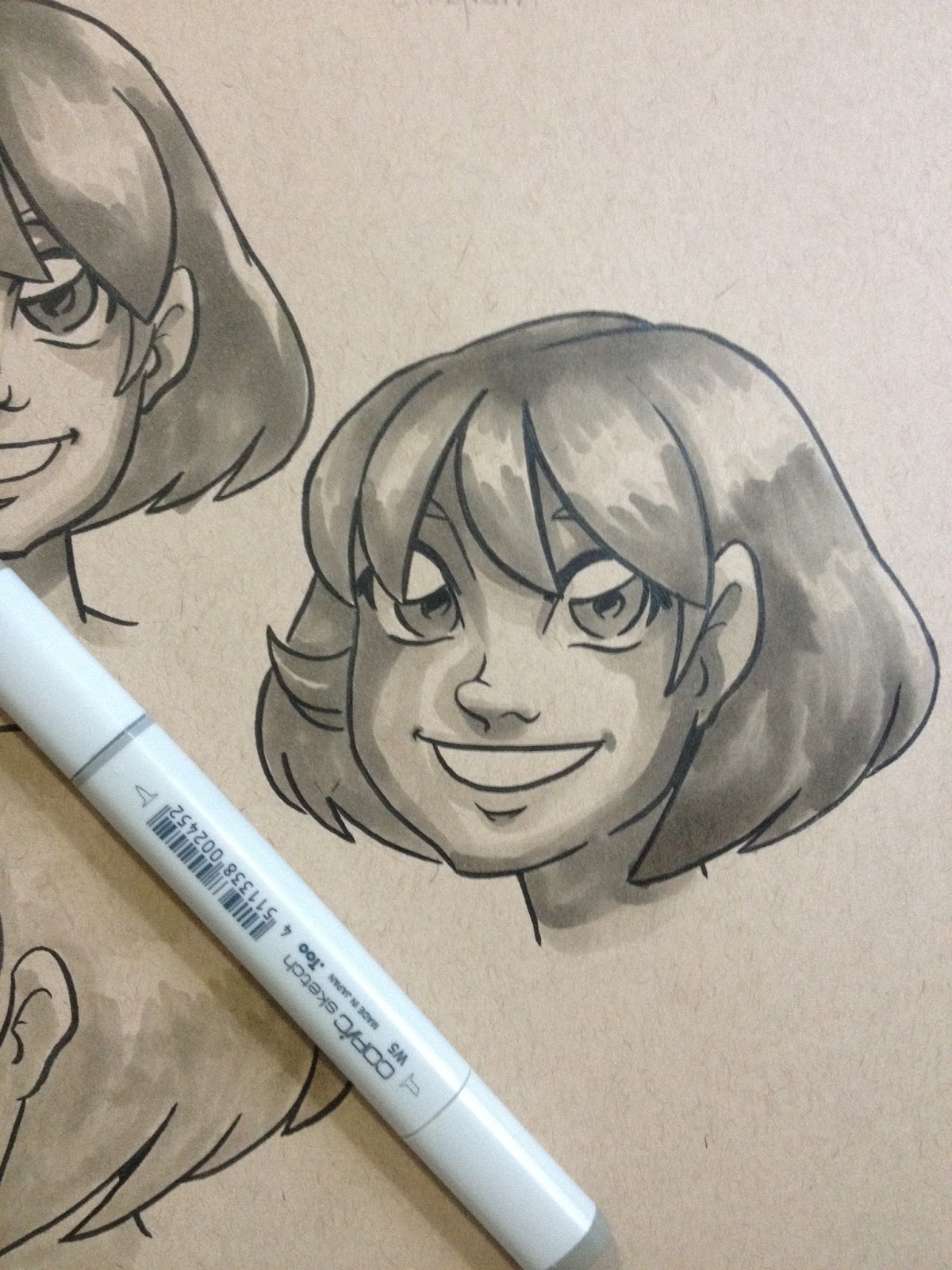
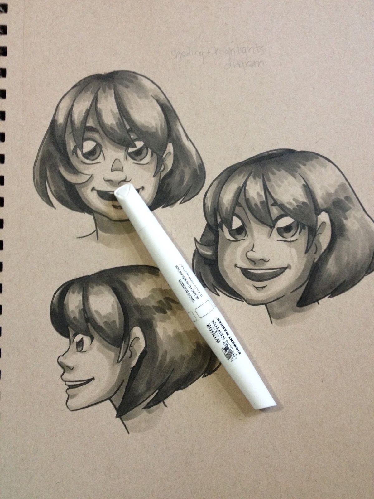
For kicks and giggles, I used some opaque white media (Winsor & Newton white pigment marker) to add white highlights and make the tonal study pop.


You can use colored pencils and watercolors to stretch how far your markers go- once you've finished applying your marker color, you can add highlights, shadows, contrasting color, and details with color pencils and markers.
If you really want to get better at using markers as an art medium, do studies. Do them in Copic, do them in Watercolor (many of the prinicpals of color application are the same), do them regularly from photographs and from life.
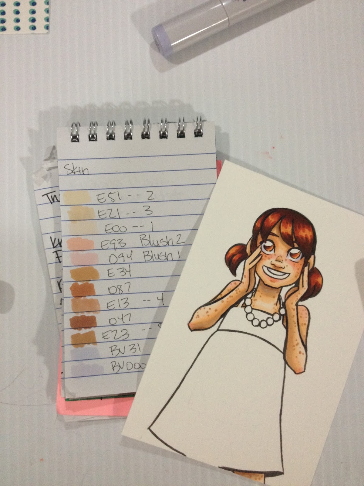
Color Swatching for Reference
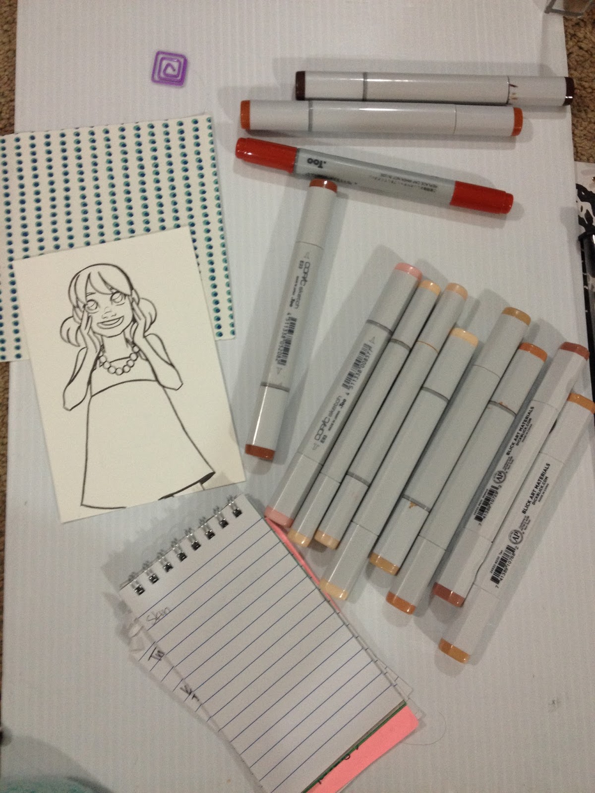
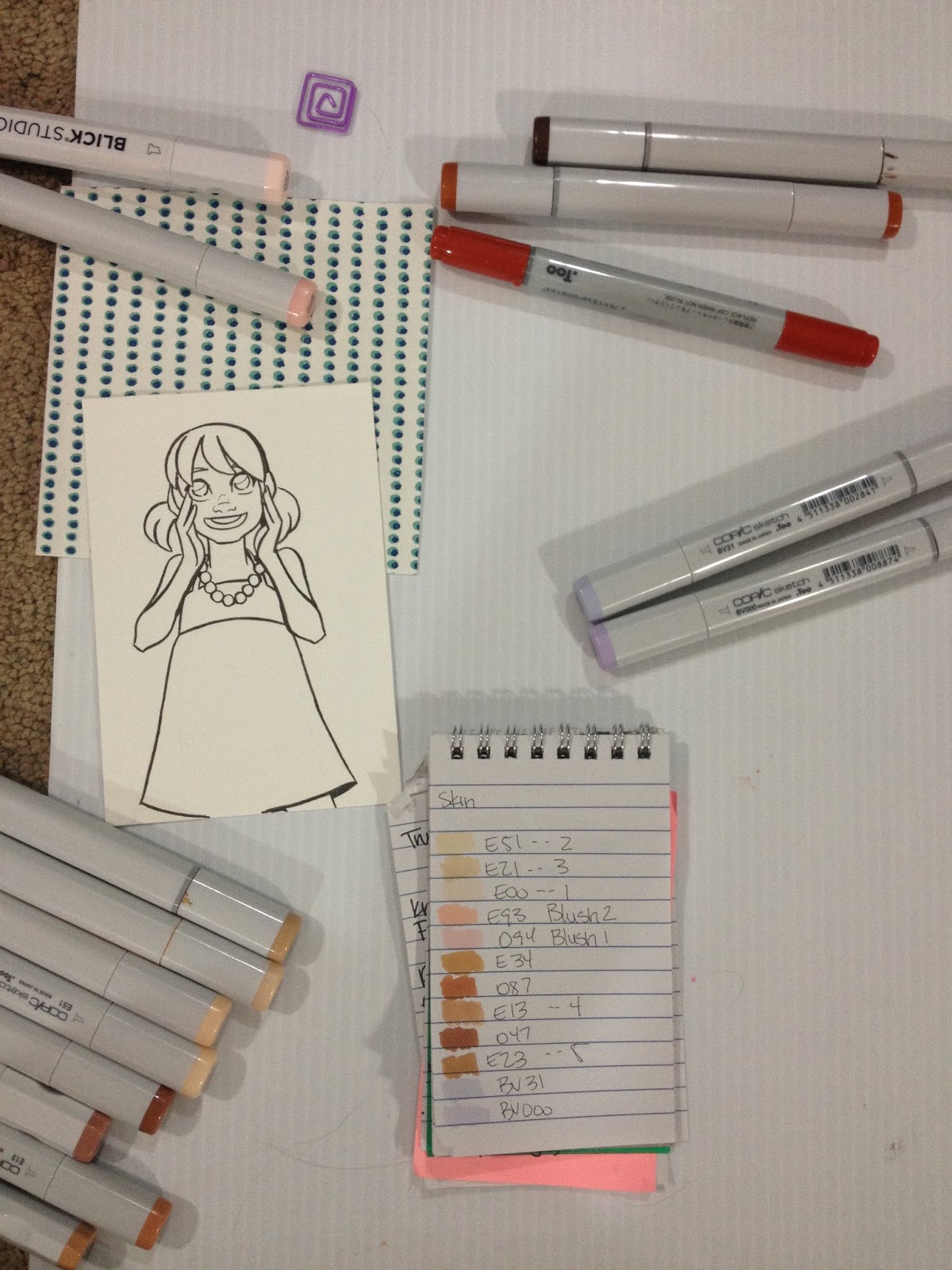
I've found that it helps to make swatches of all the possible colors I want to use and then cross out the ones that won't work, and number the ones I think will in order that I want to use them. If you find yourself using the same colors over and over (for skintones, hair, animals), consider tacking up those cheat sheets for quick reference. Although Copic's color chips are A LOT more reliable than most other brands, they are still not 100% accurate, so it's wise to make swatches before you risk ruining something, especially if you're trying to do color matching.
Step 1: Select all possible markers you might use for the piece.

Step 2: Swatch on the paper, and make sure you note the color numbers.

Step 3: Number in order of use.

Step 4: Final Piece

Selecting A Paper for Your Illustration
For many layers of color, subtle gradient changes:
You want something thick that will absorb your ink. Good choices include uncoated cardstock, wood pulp based watercolor paper (both hot and cold press, but not rough), and smooth or plate bristol. These dense fibers will hold the ink and keep it wet longer, so this is perfect if you really like smooth blends, but tends to make fine details feather out. This tutorial uses watercolor paper that has been inked with a Copic-proof Sailor Mitsuo Aida. This is my preferred paper for marker illustrations.
For clean, sharp changes in color, few layers, striking special effects with alcohol and colorless blender:
Coated, thinner, non-absorbive papers like tracing paper, Copic papers, and marker paper in general are good if you want more dramatic transitions, or enjoy putting in lots of fine detail, or like special effects. On coated papers, the ink will sit on top of the paper rather than soaking in, and is easily reactivated. Tracing paper is also a very viable option, especially if you want to add color to a sketch, but can't add it to the original due to correction fluid, or sketching materials.
My favorite colors for Caucasian skin:
E000
E51
E21
E34
E13
Freckles:
E34
E13
E23
You can get these colors below, and help support this blog!
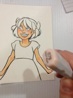
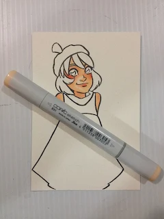
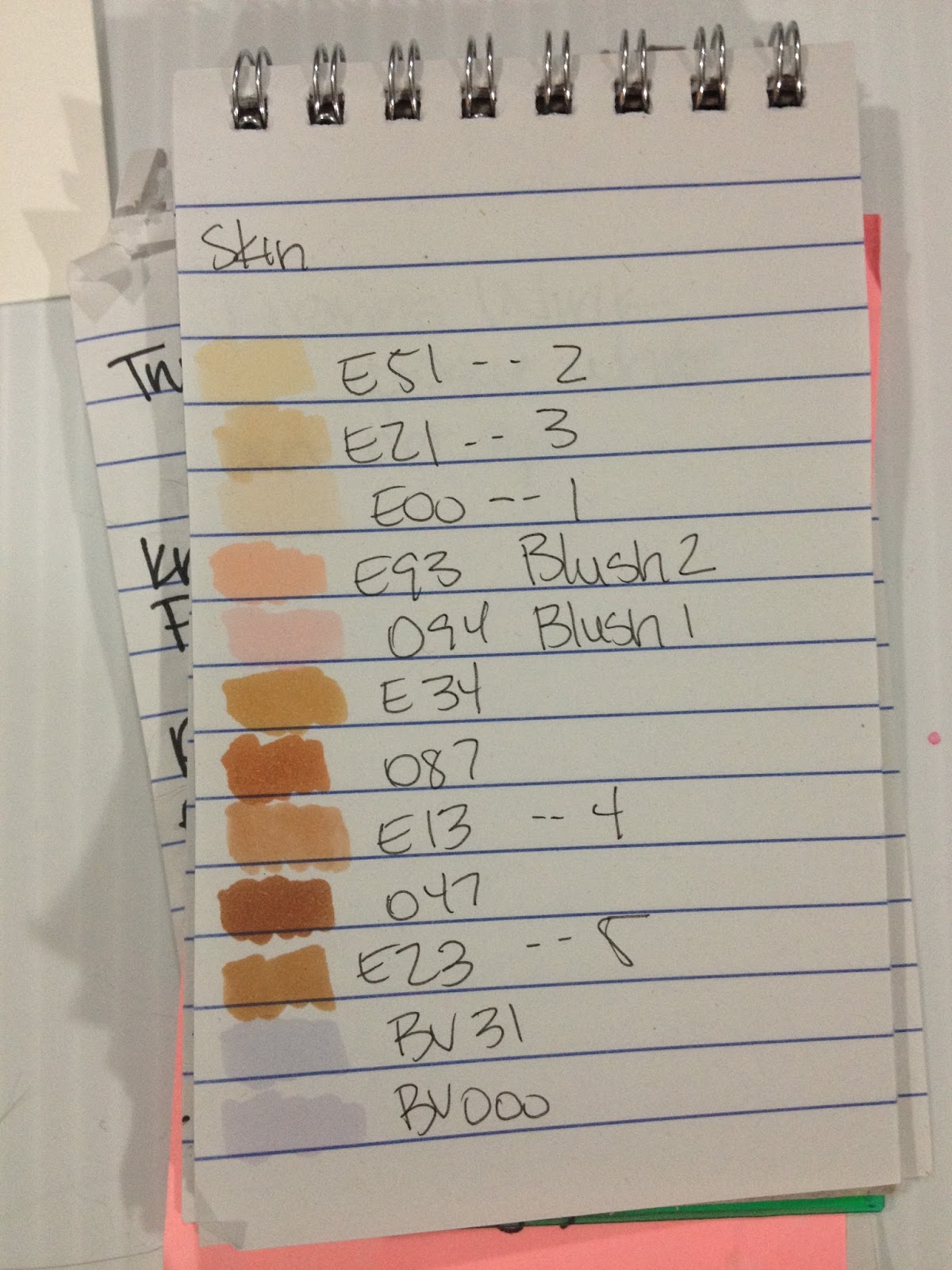
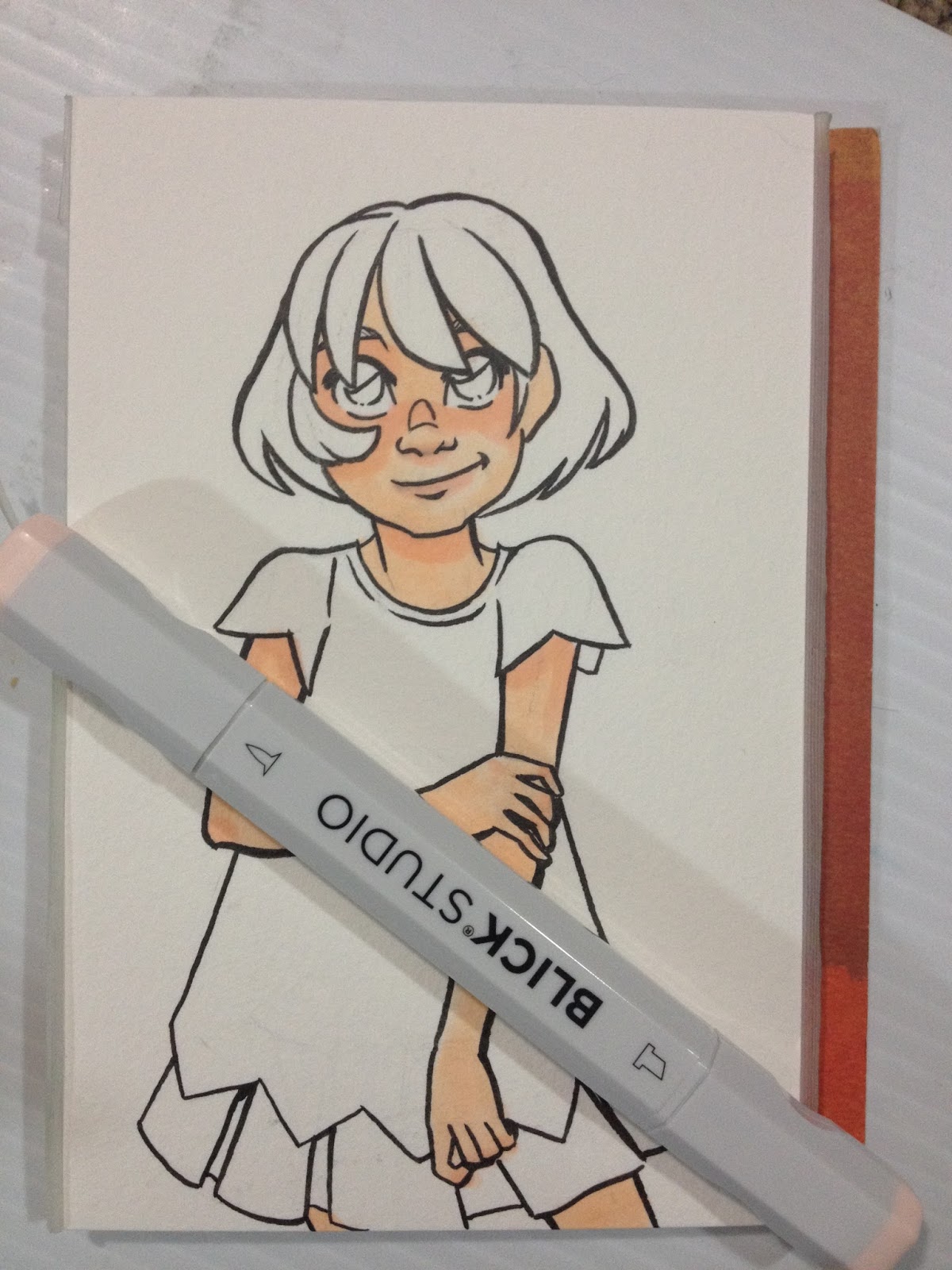
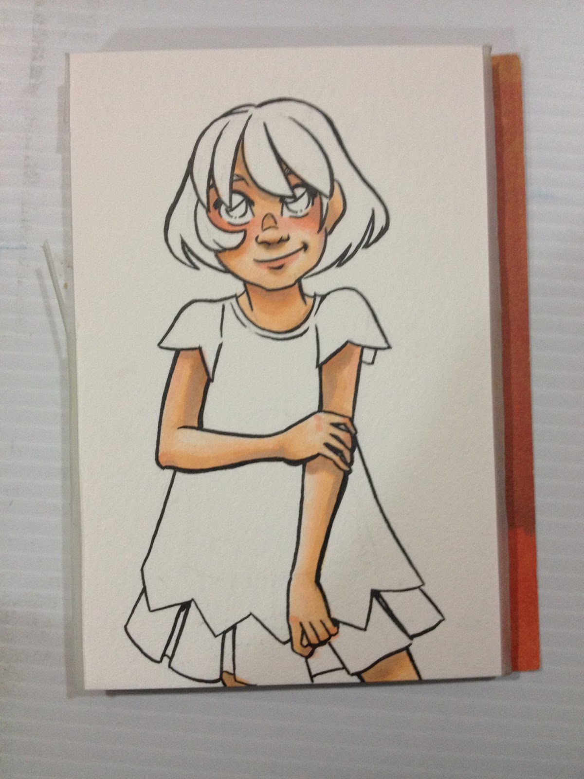
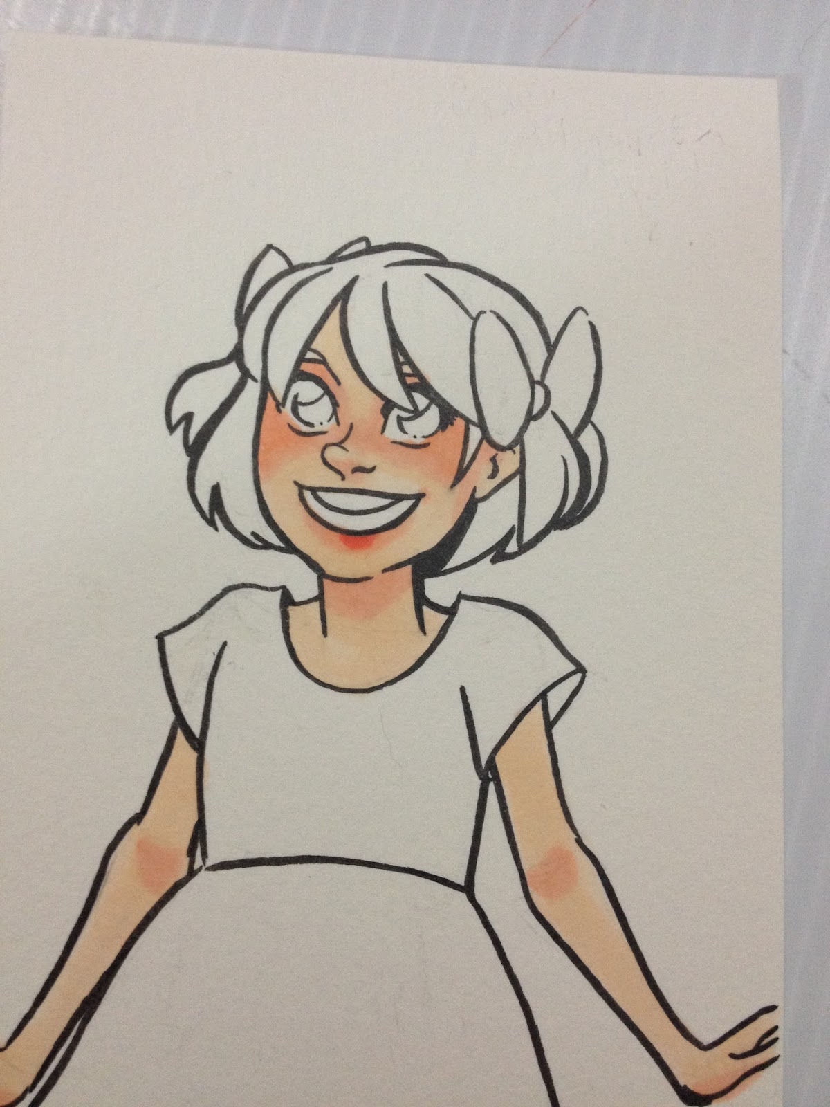
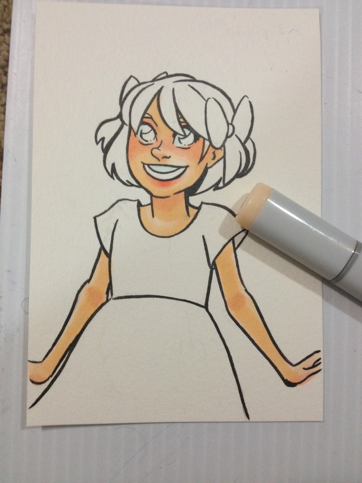
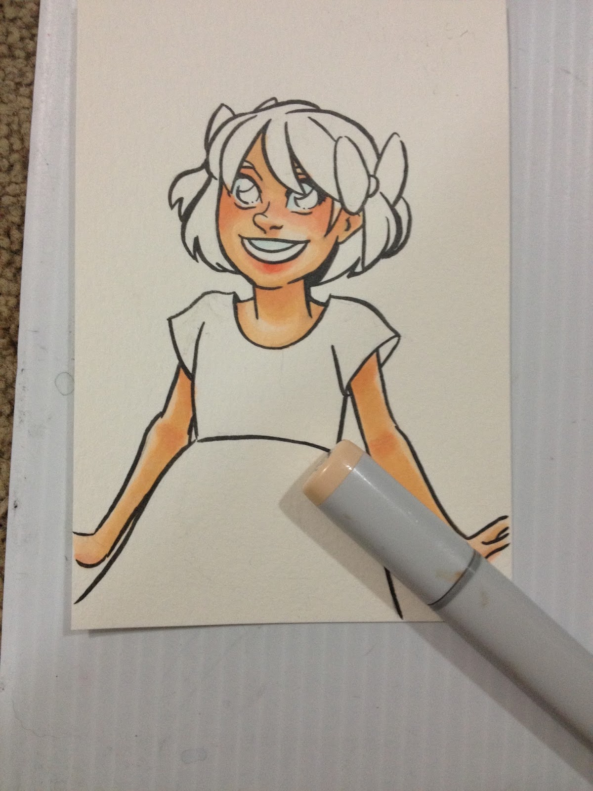
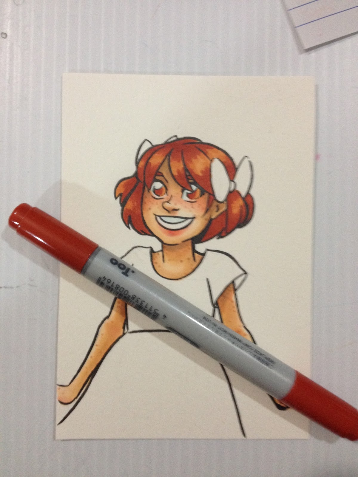
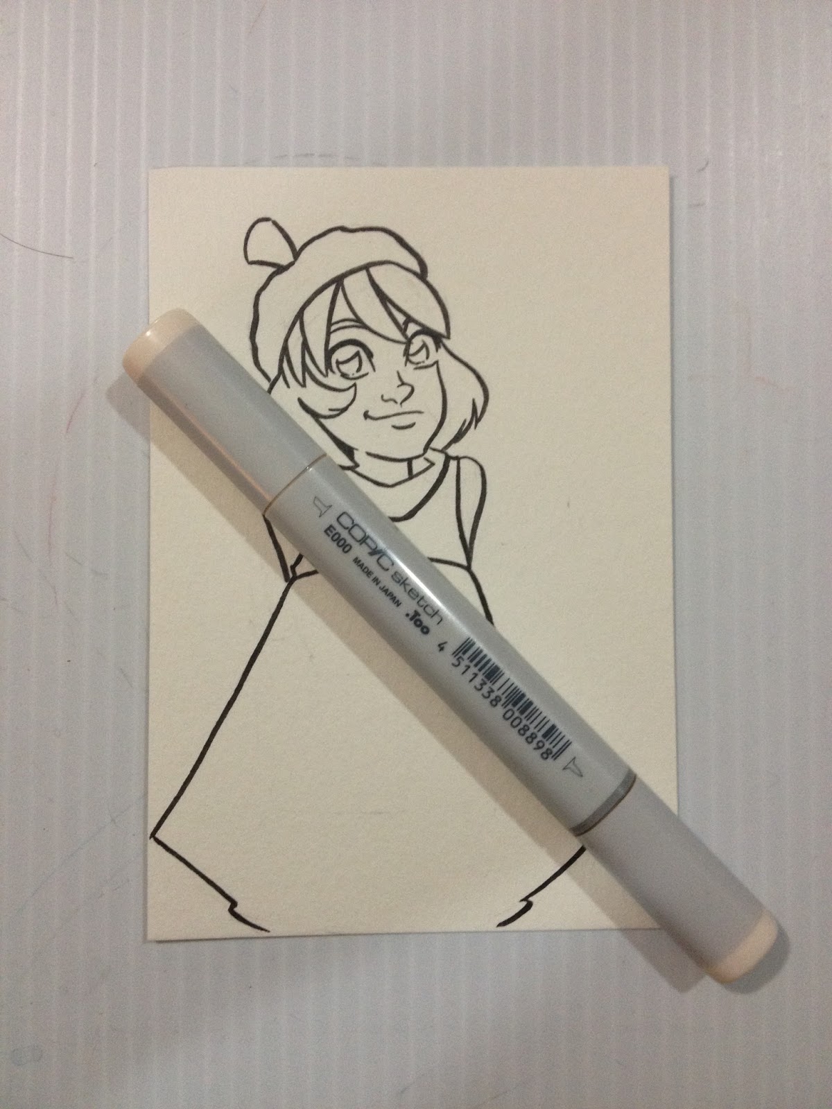
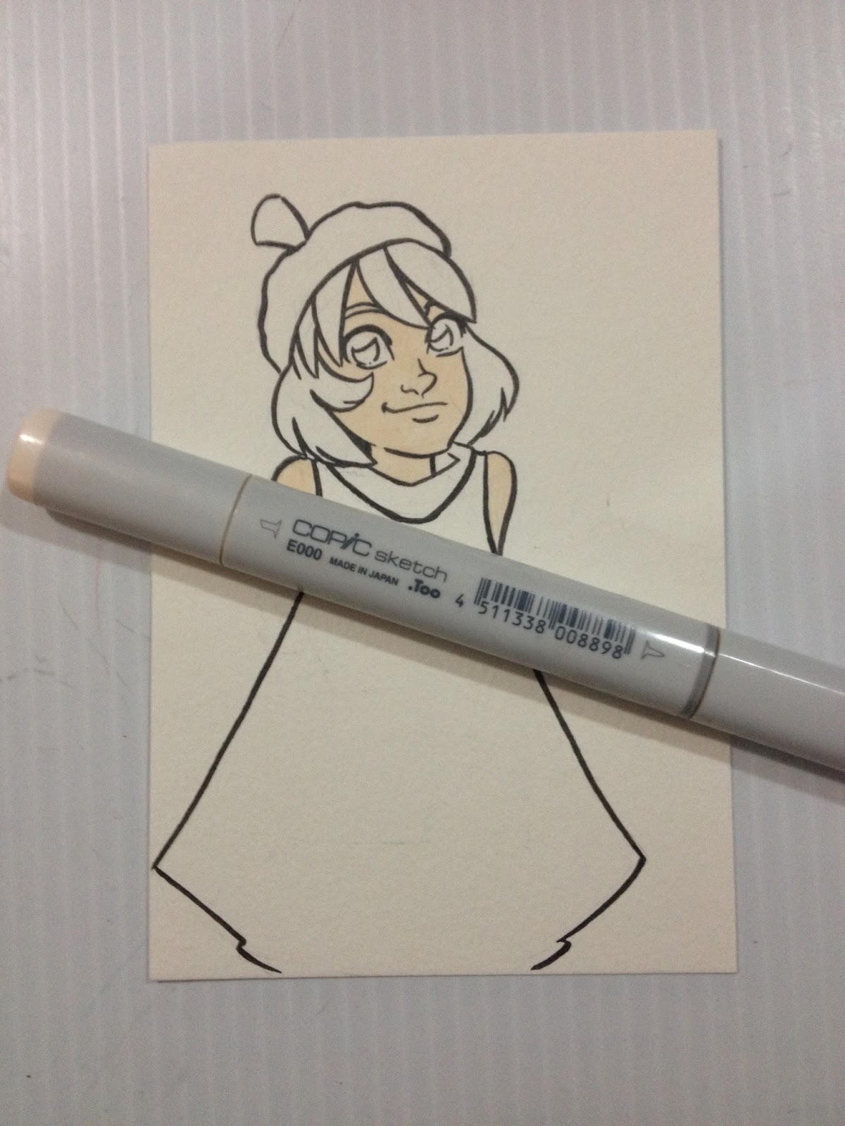
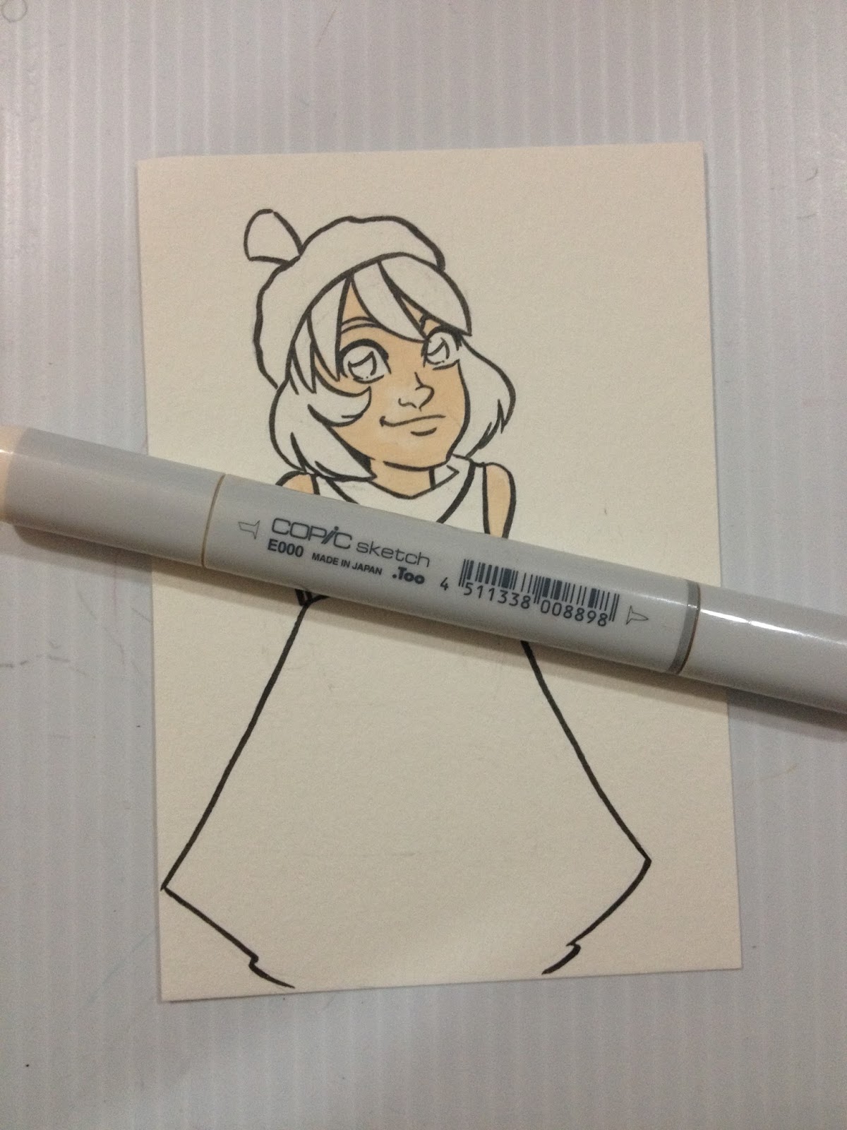
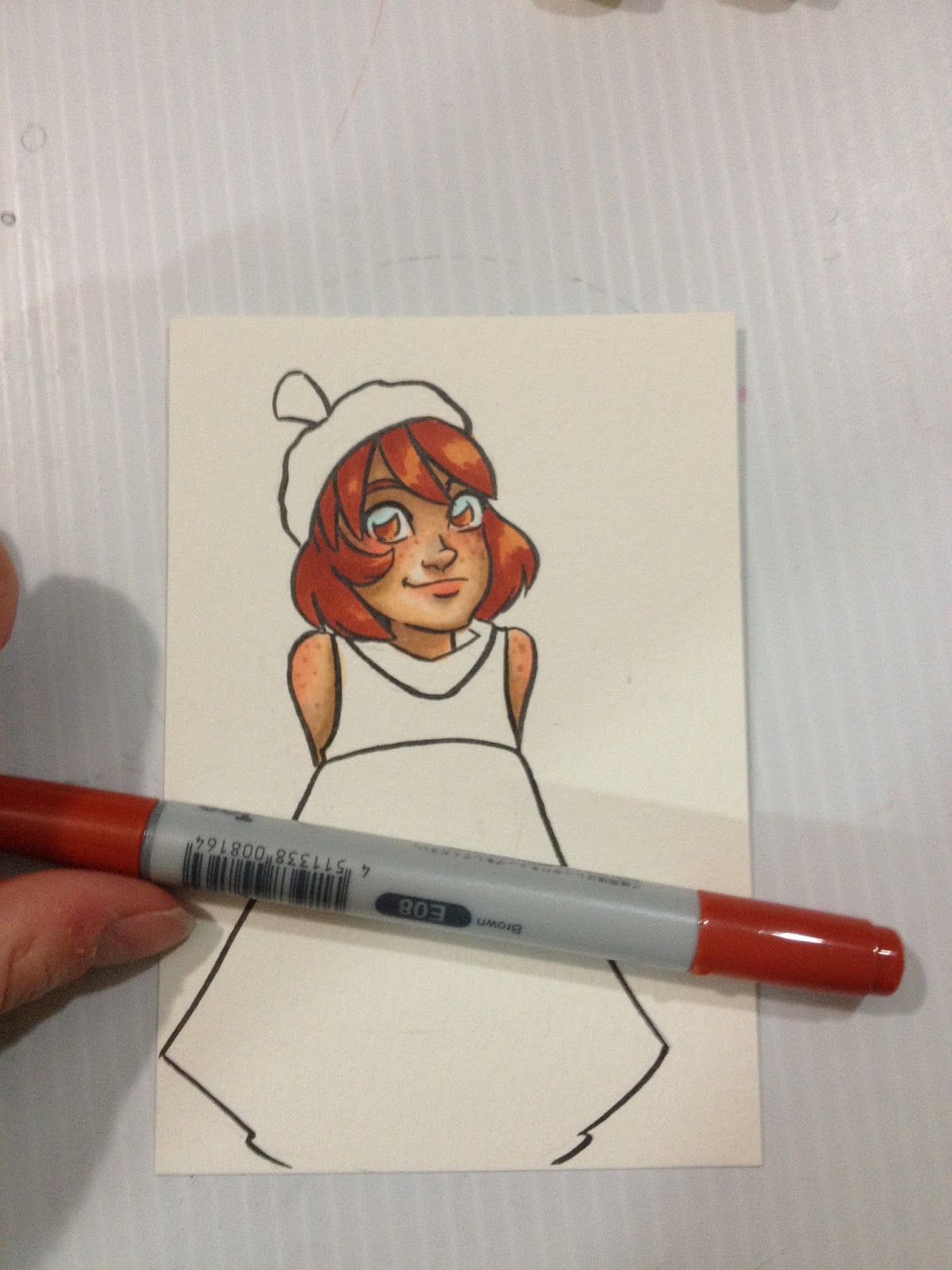
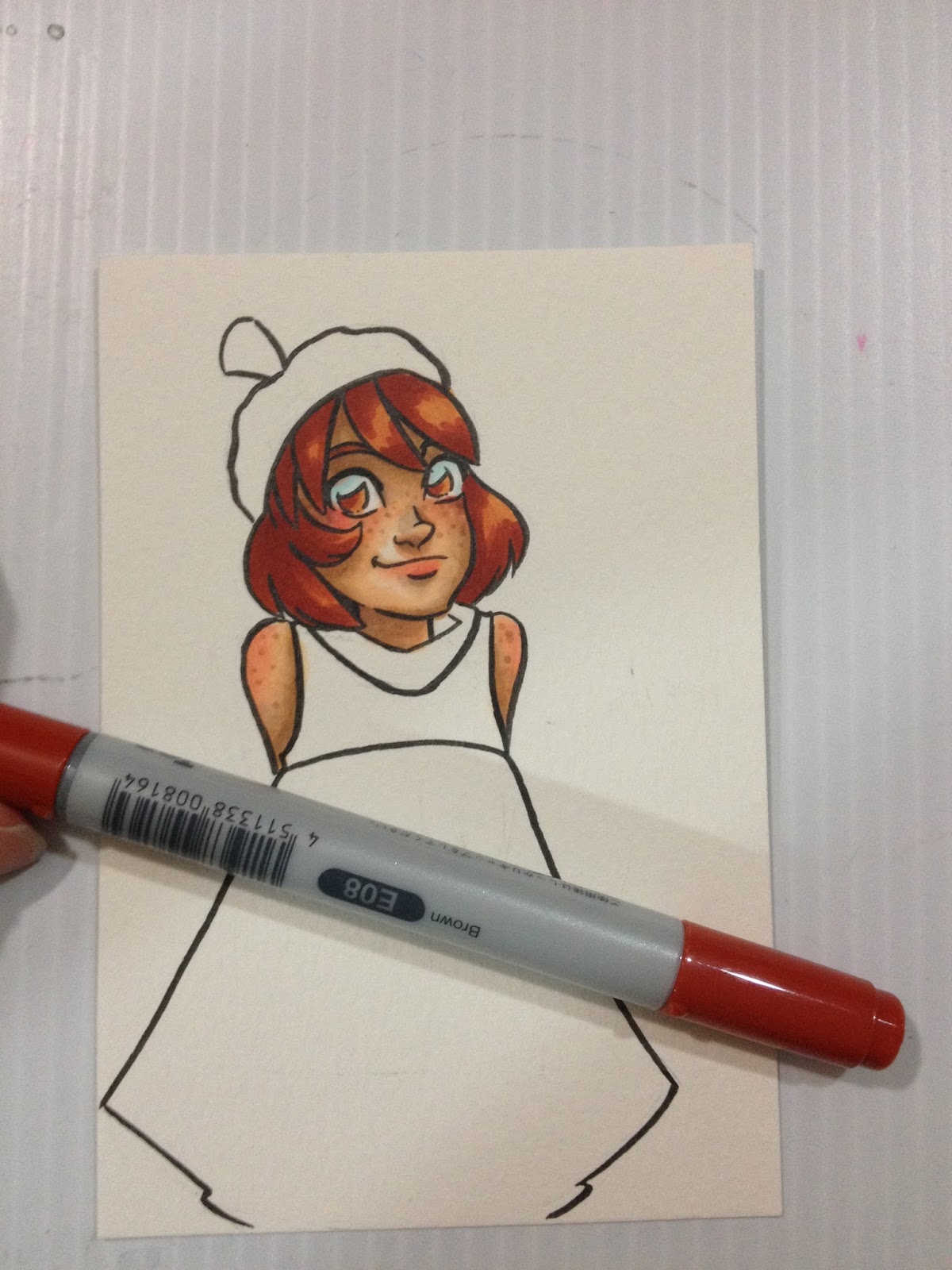
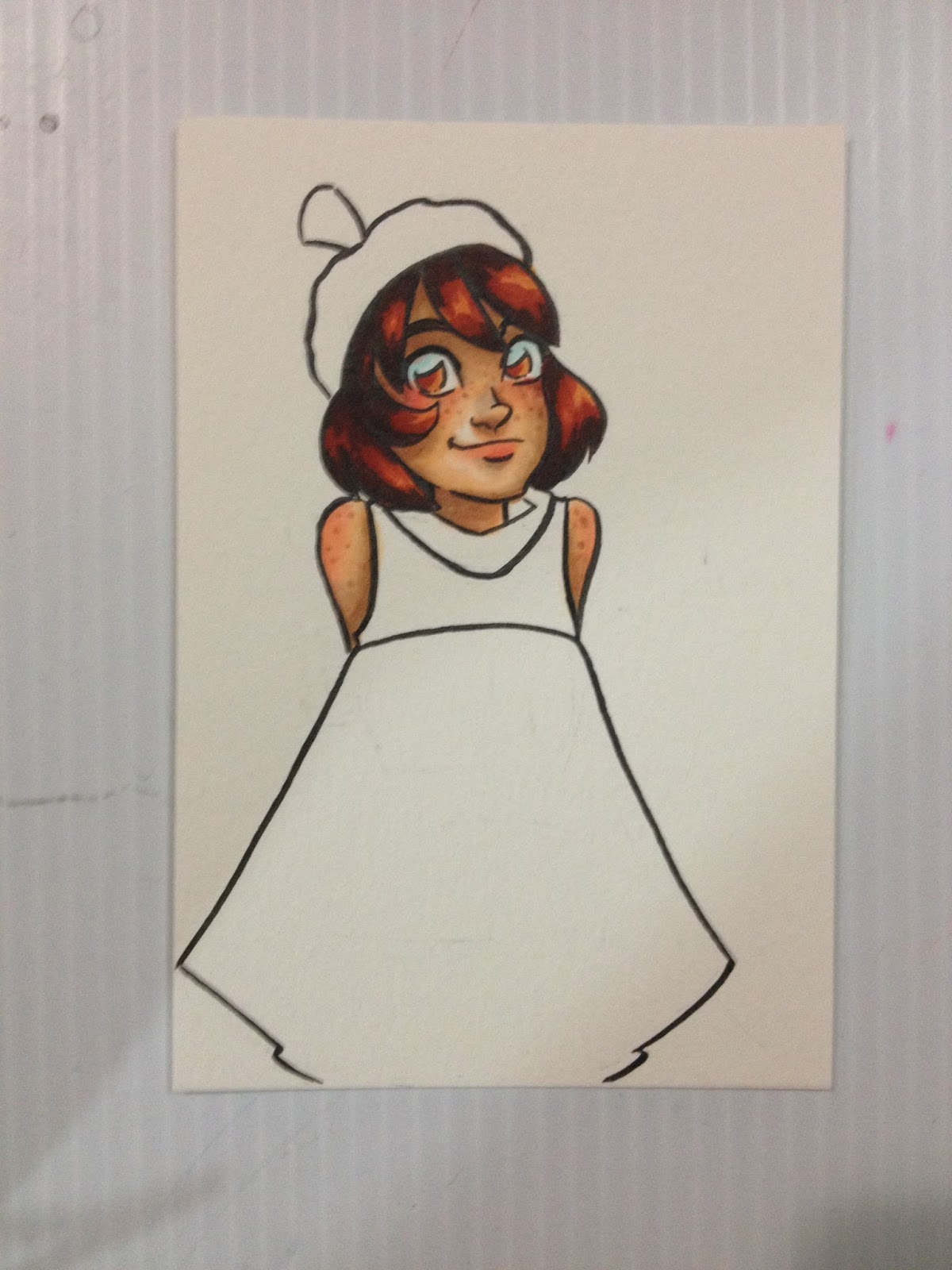
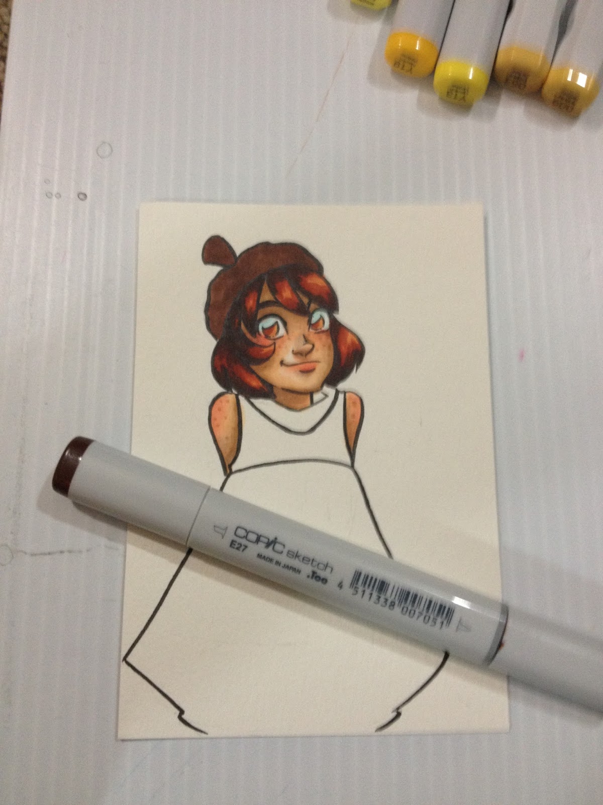
How I Color Kara's Skin

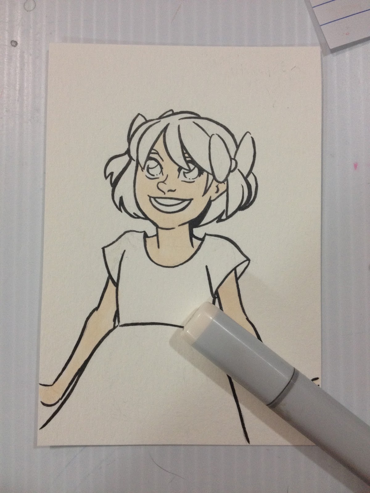
I apply an all over base layer of E00- Milky White. Aplying a base layer means that your subsequent layers won't have streaking, because you've primed the paper. It also helps facilitate blending between all layers. If you prefer strong, sharp shadows, allow your paper to dry for 5-10 minutes before applying that color.


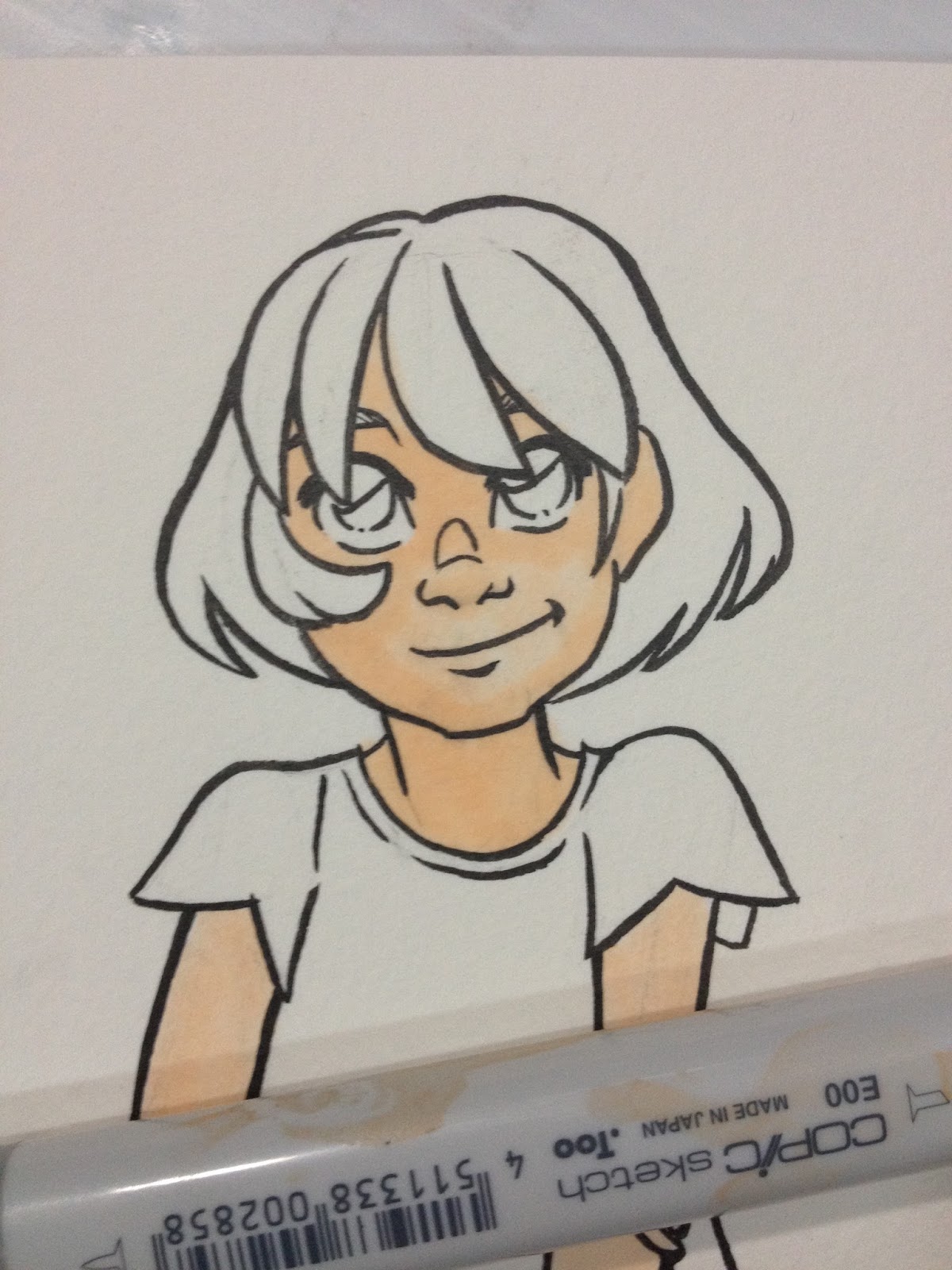
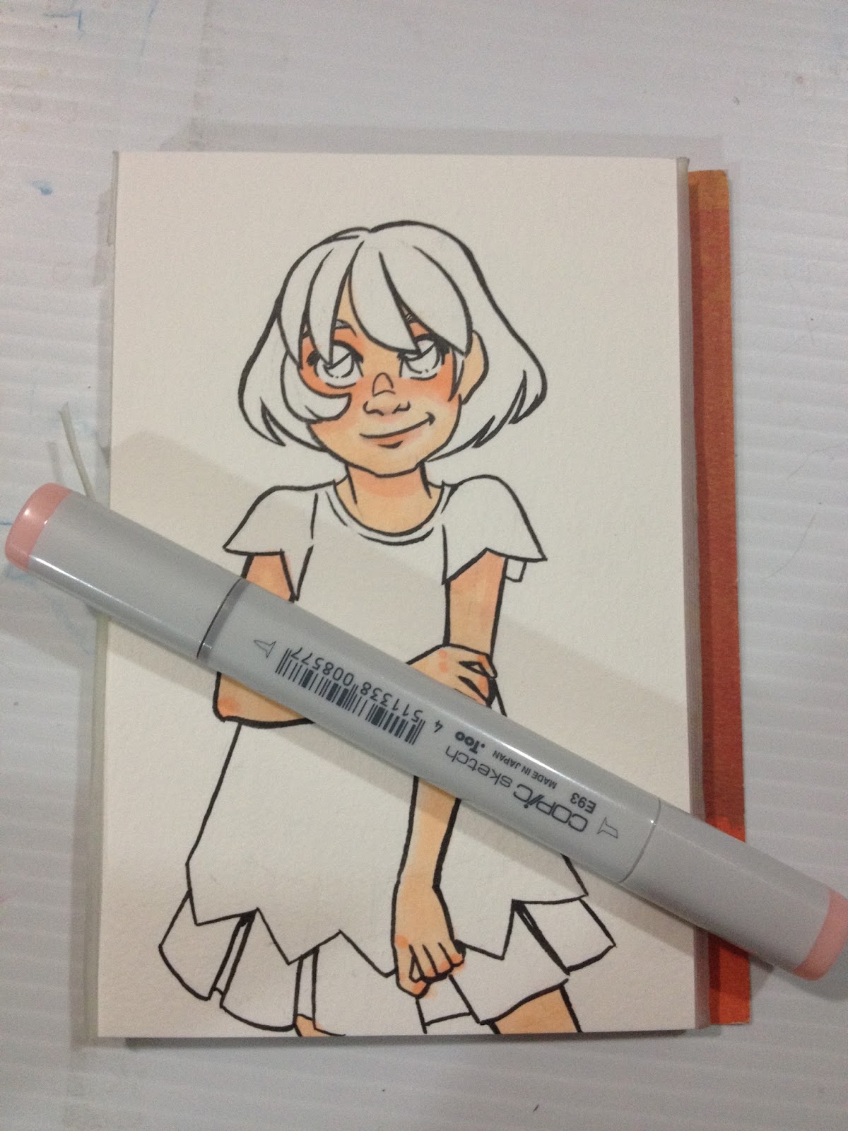
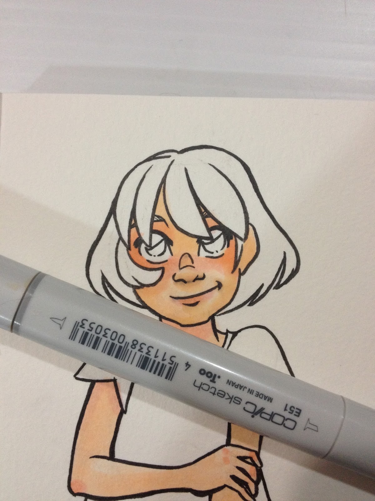
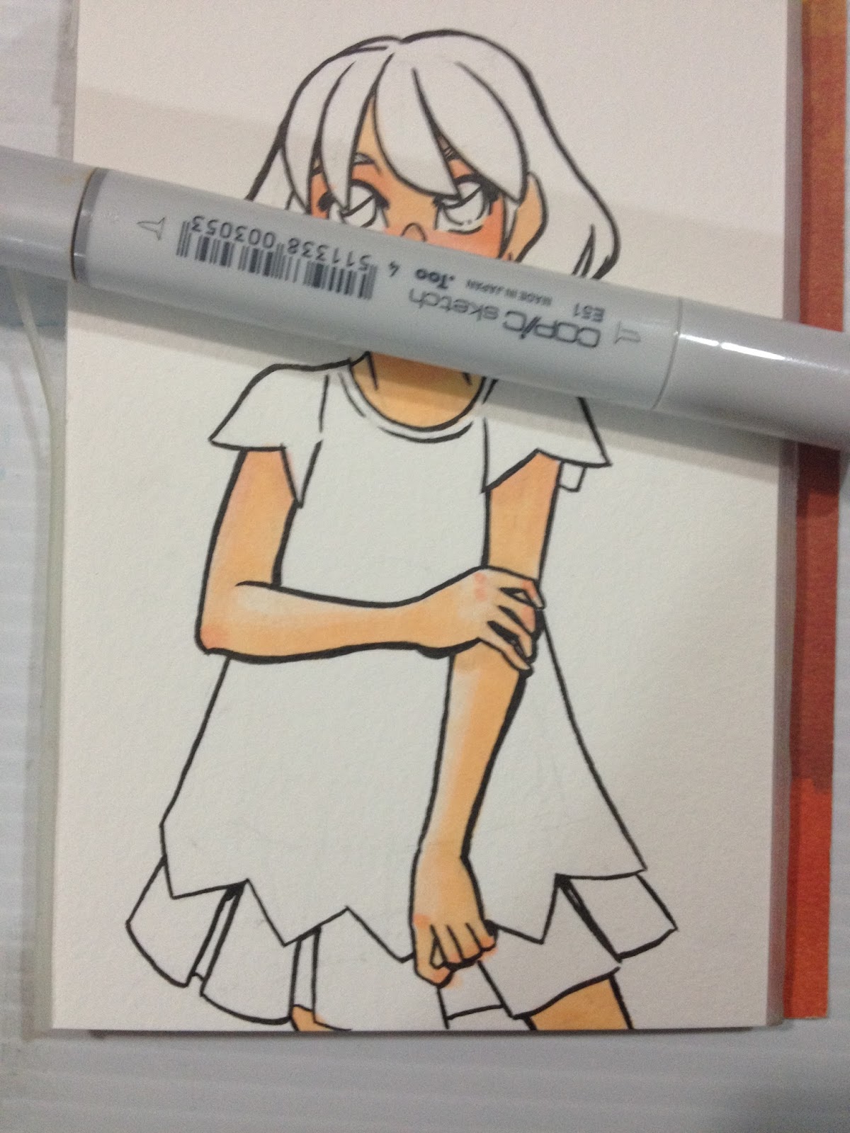
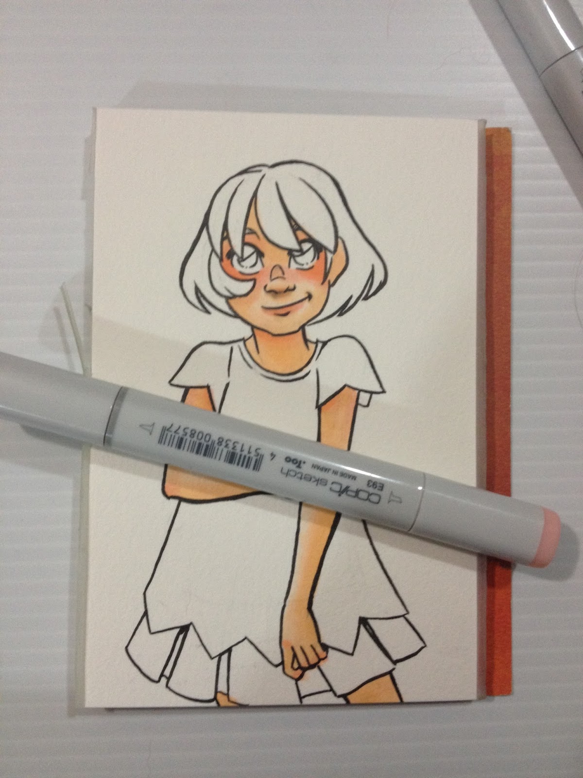
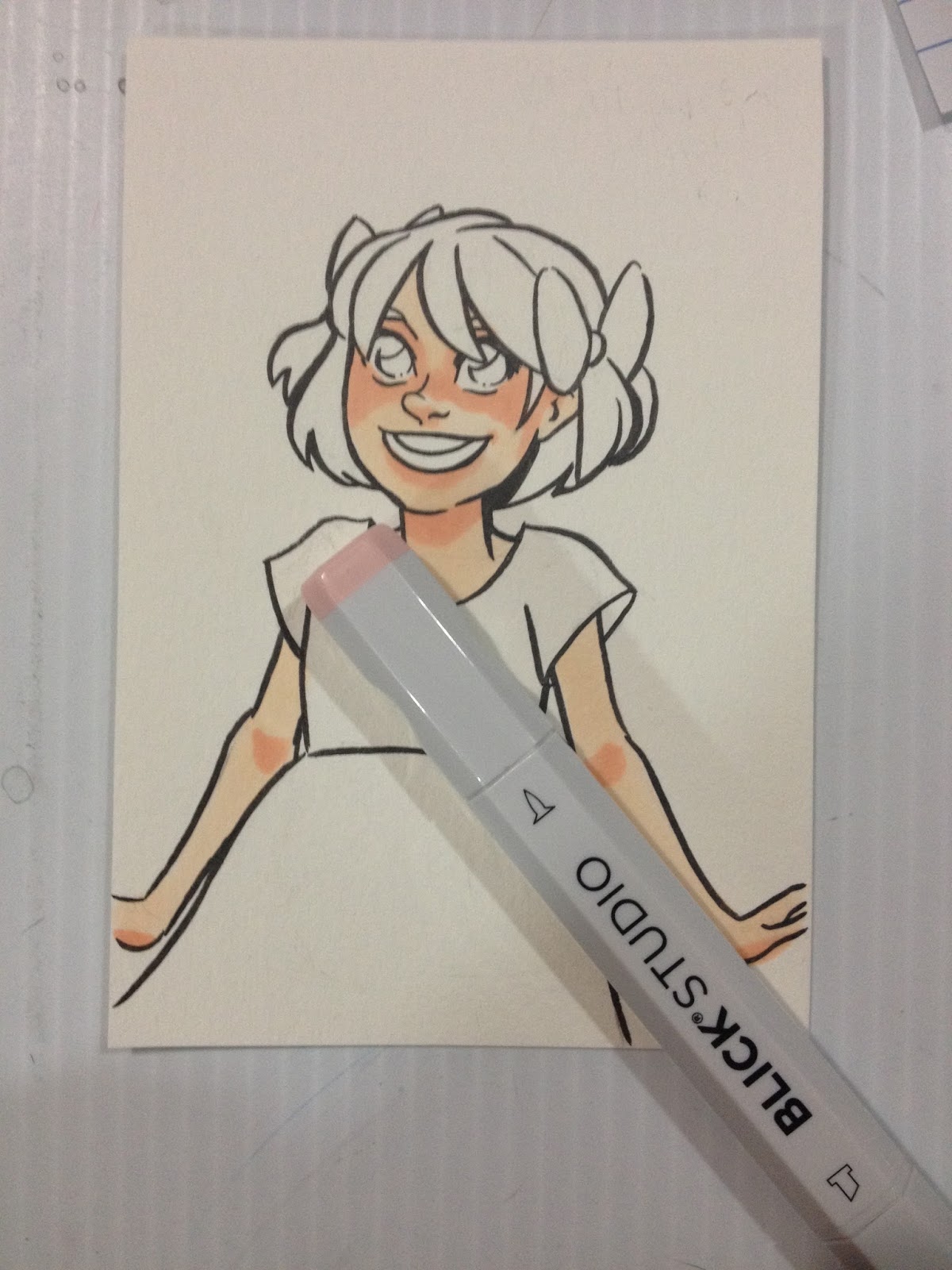
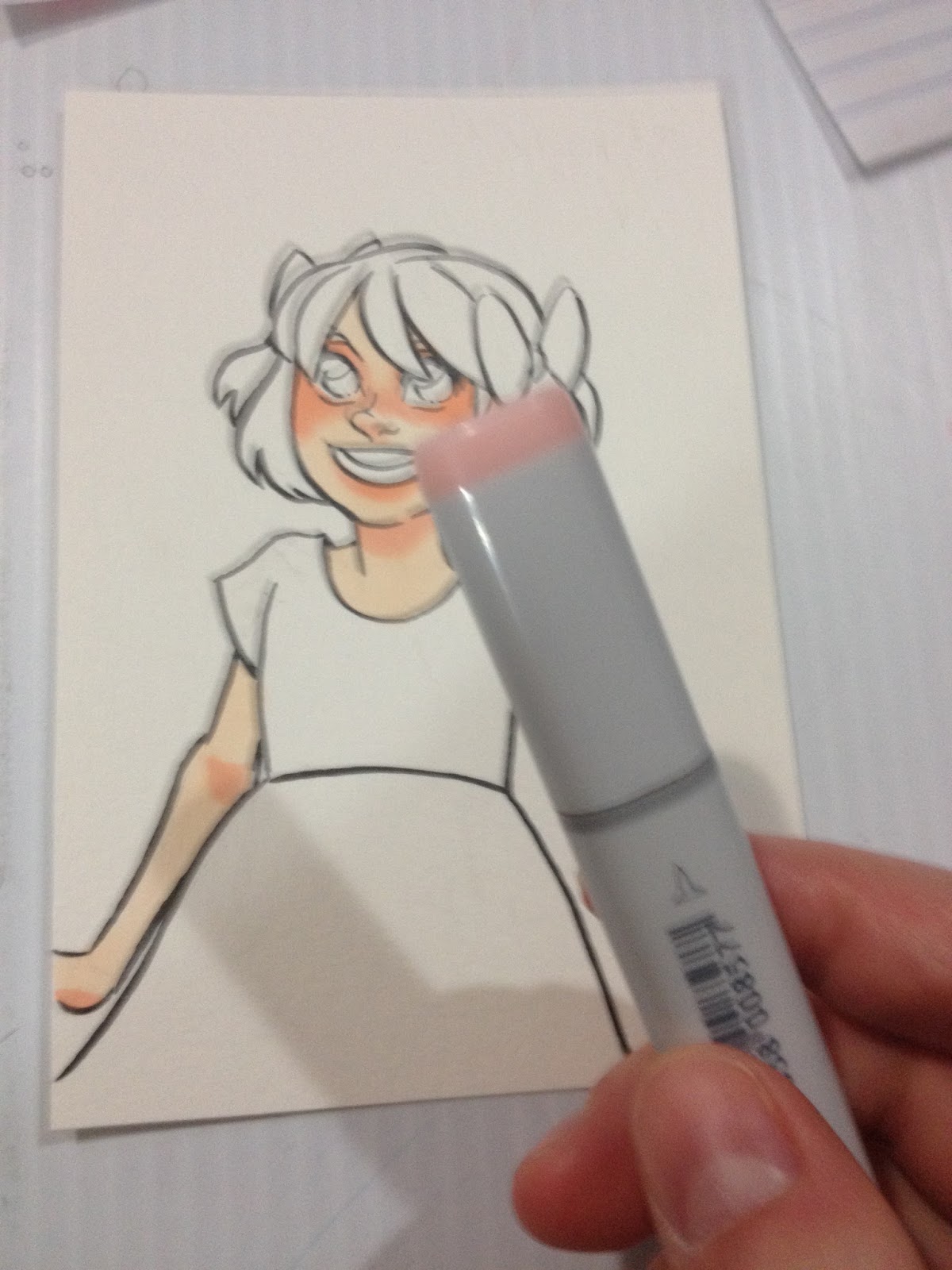
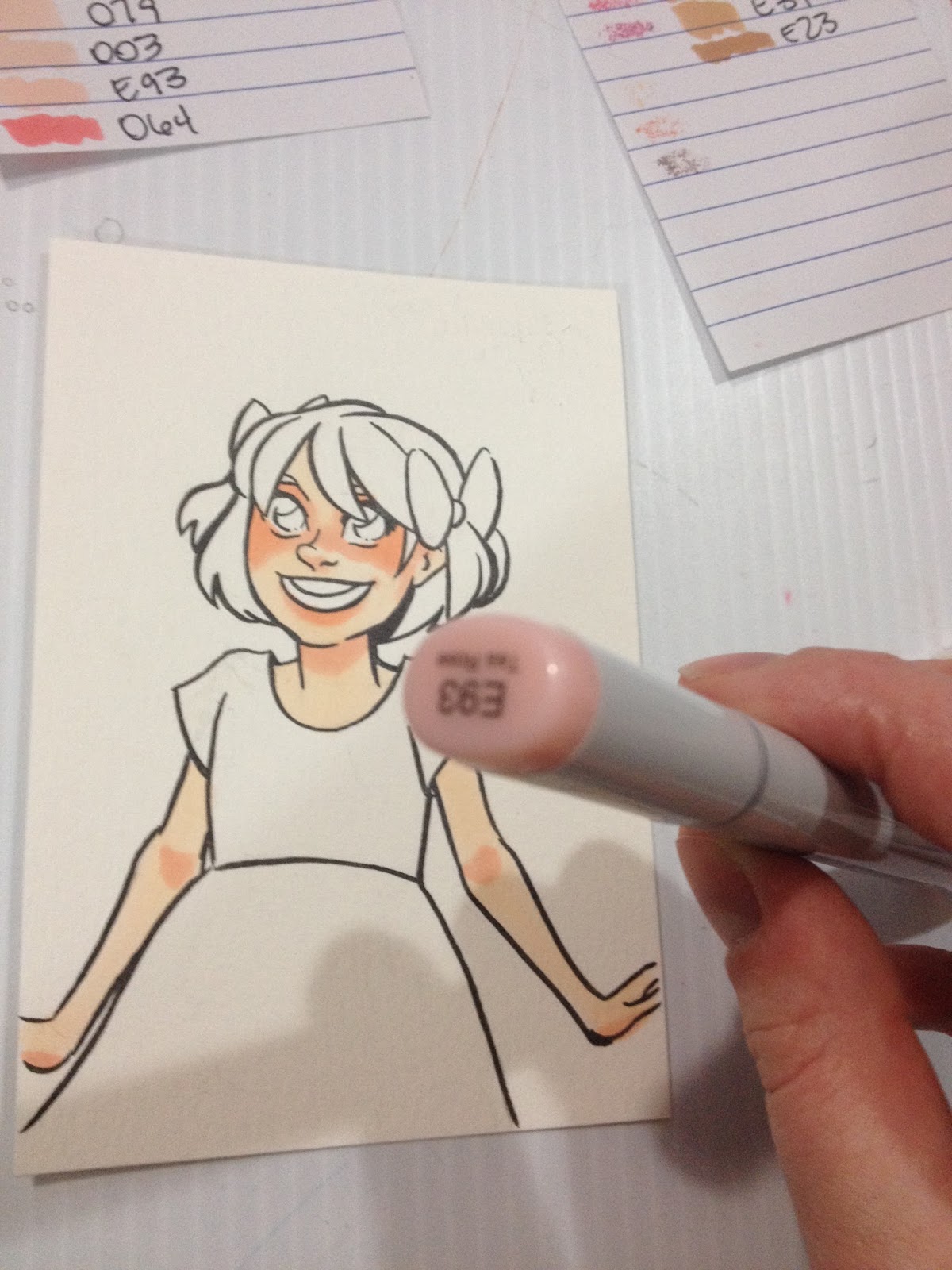
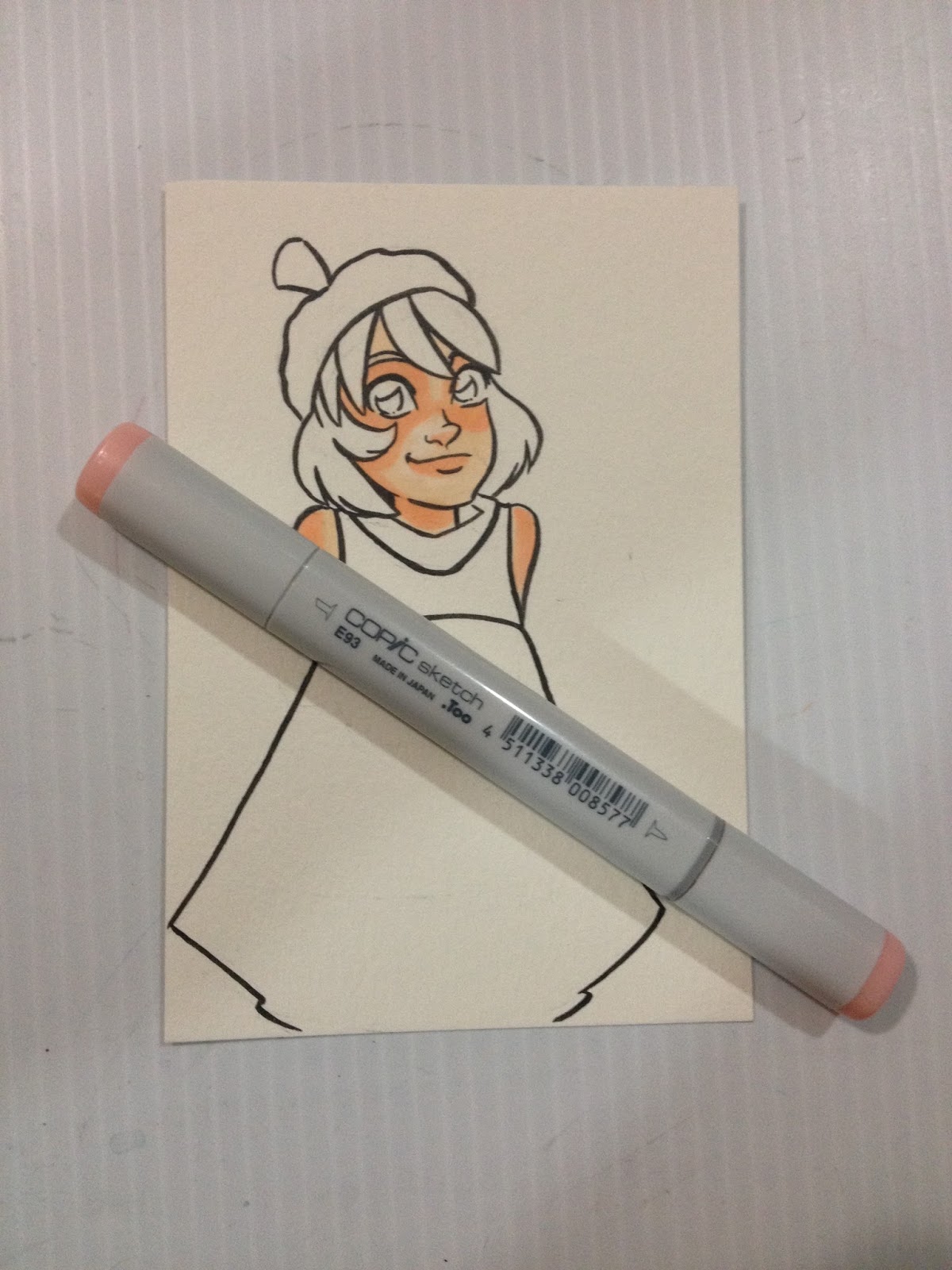
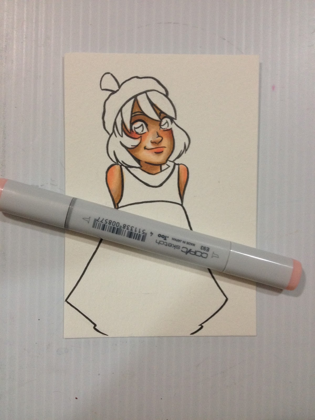
I use Blick Studio's Shell Pink to block in blush- Kara's cheeks and across the bridge of her nose, above her eyelids, the underside of her nose, lips, under her chin, elbows, knuckles. I darken this up a bit with Copic's E93- Tea Rose.


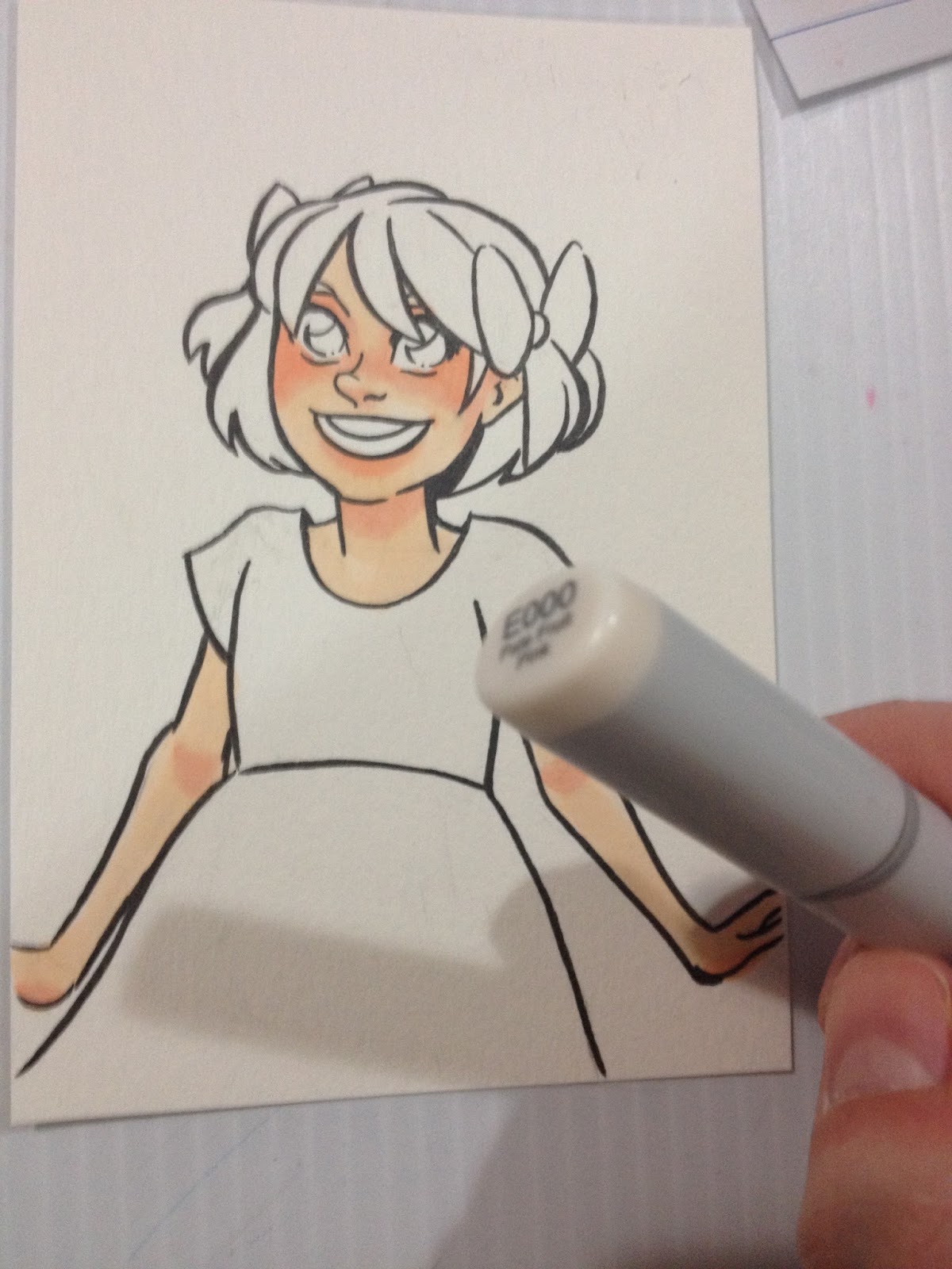
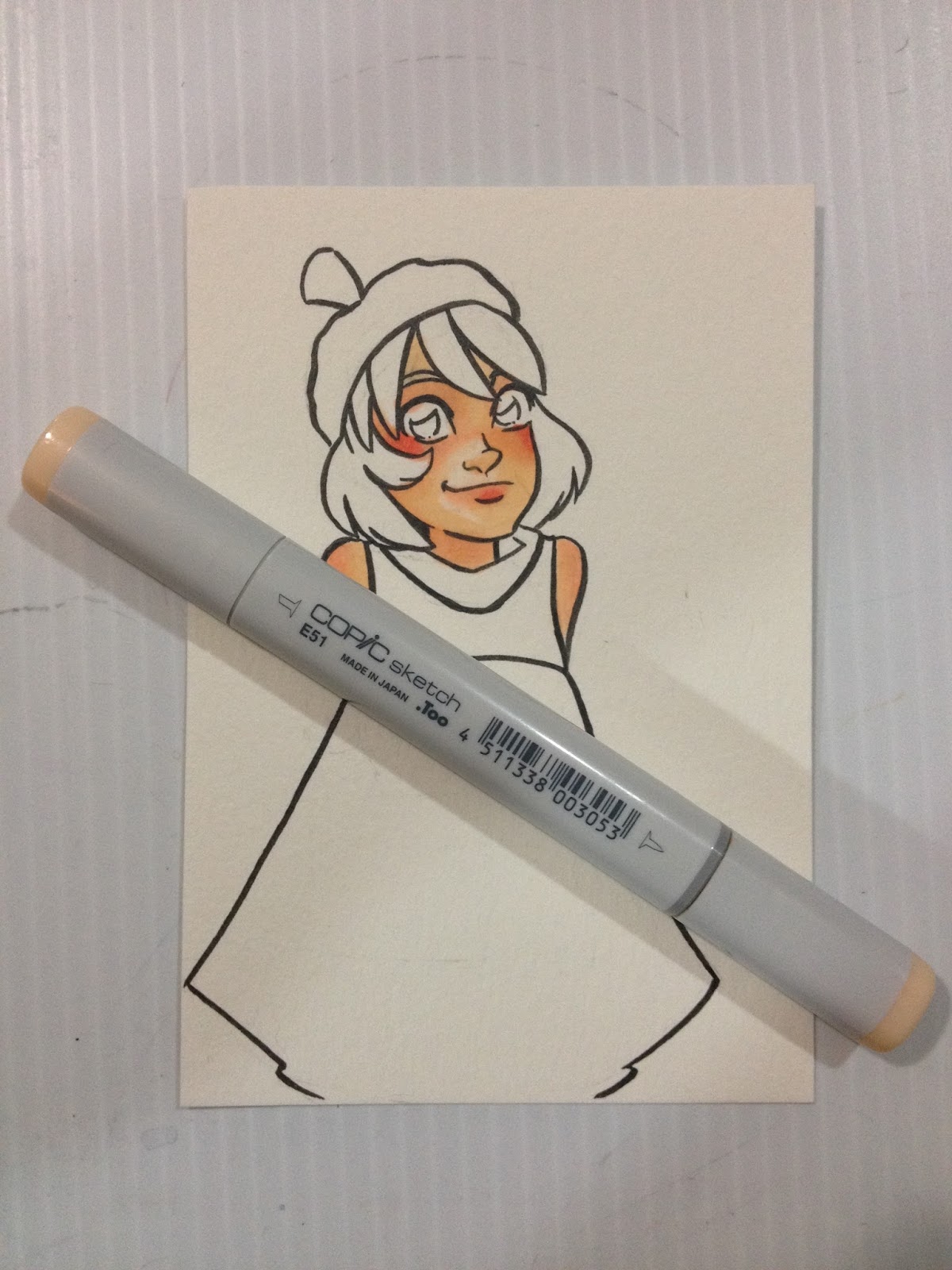
Once I've made the skin's shadows as dark as I can with the E00, I switch to E51- Milky White, to continue to darken my shadows. I mostly just intensify the shadows already put down with E00.


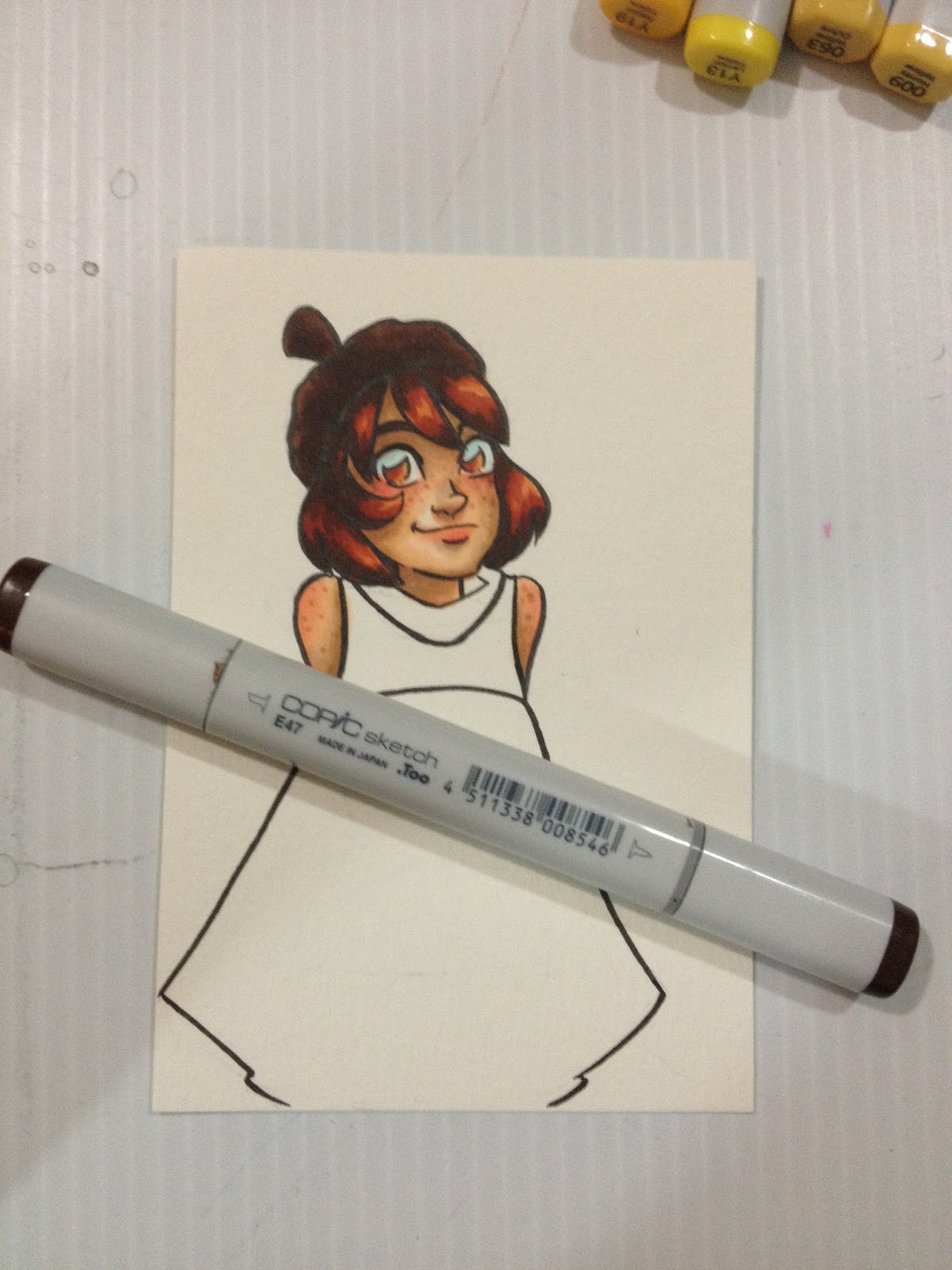
As you can see, underneath Kara's nose, the Mitsuo Aida ink smeared a bit. This is unusual- I was very careful to erase all graphite, I allowed the ink to cure fully overnight, and my marker is nice and juicy.

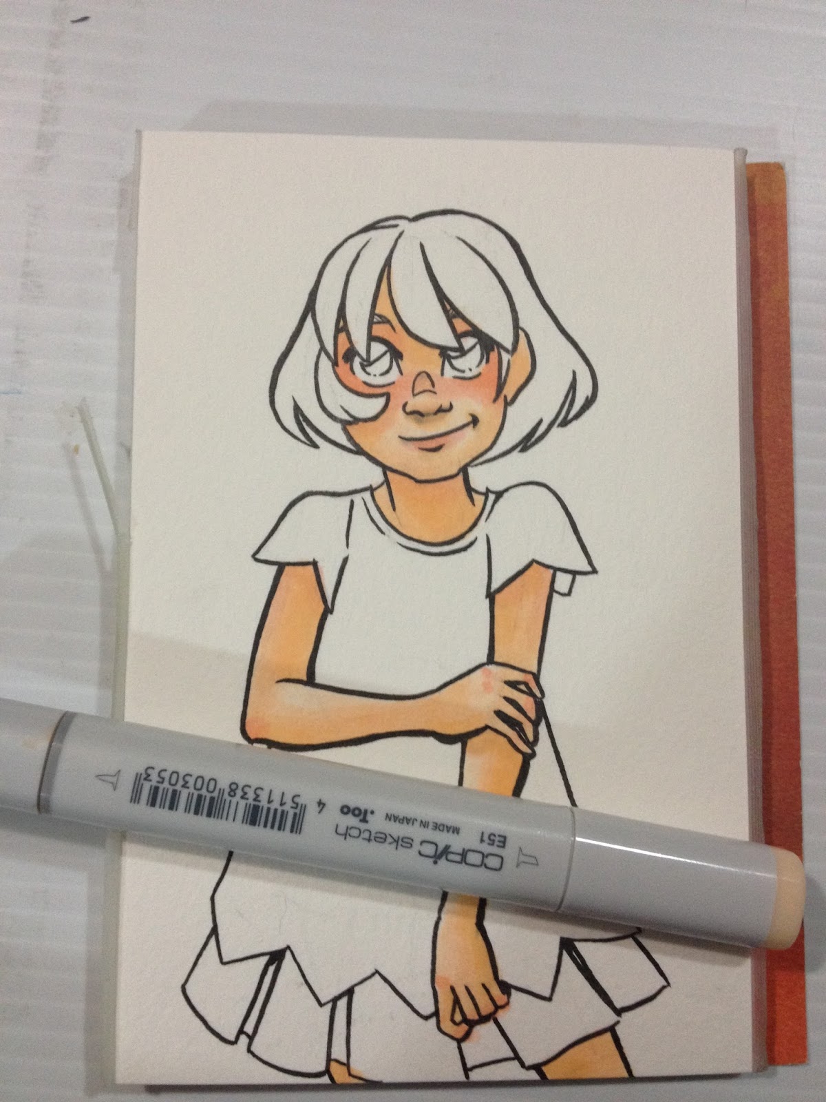
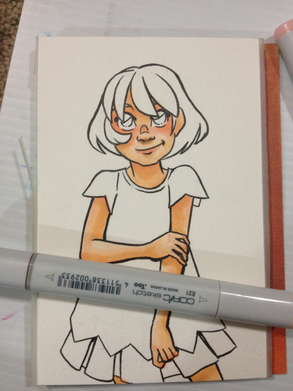
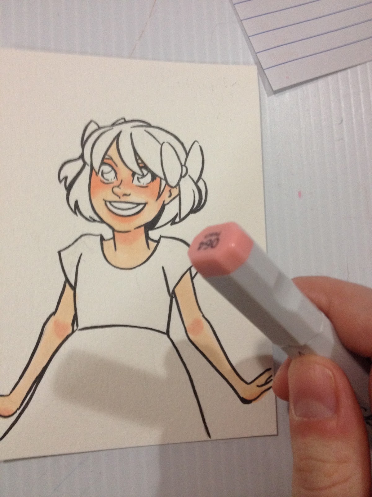
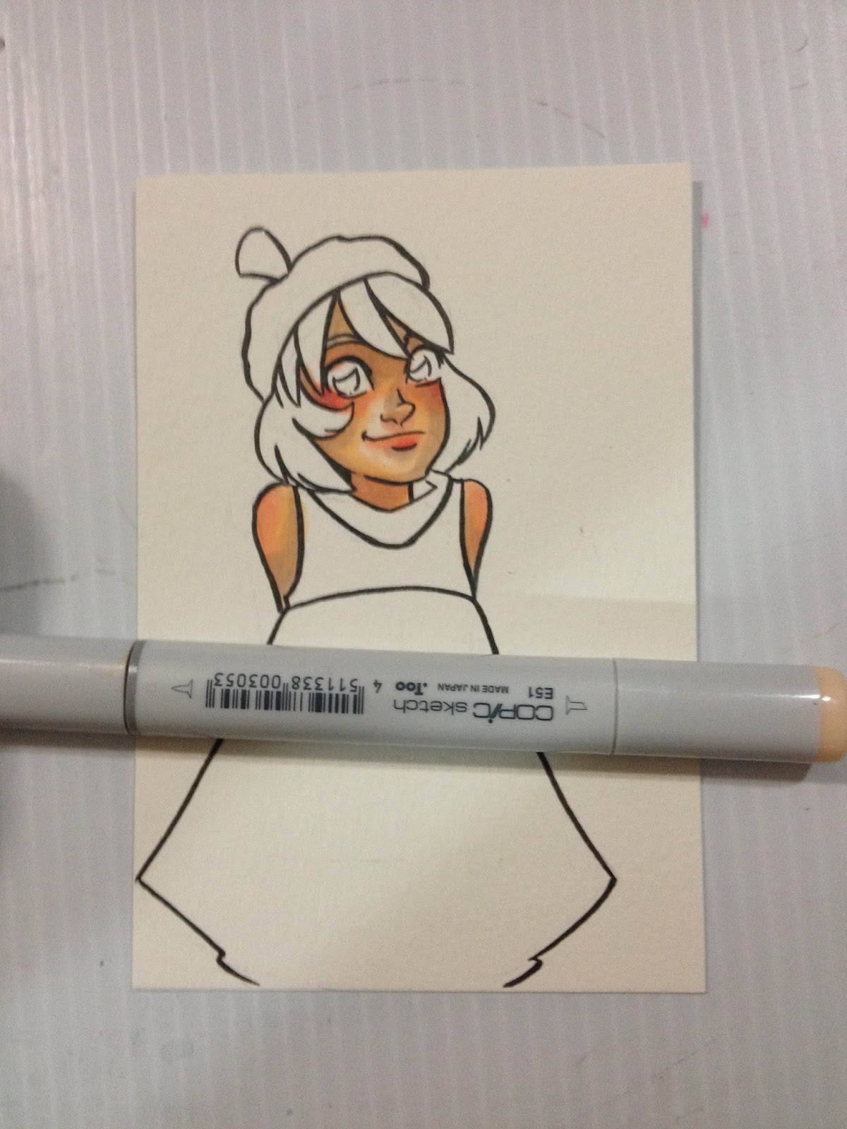
The last color I really rely on for skin toned shadows is E21- Baby Skin Pink, and I use it fairly sparingly- where direct shadows would be cast. In this example, under Kara's chin, under her bangs, under her skirt and her sleeves.

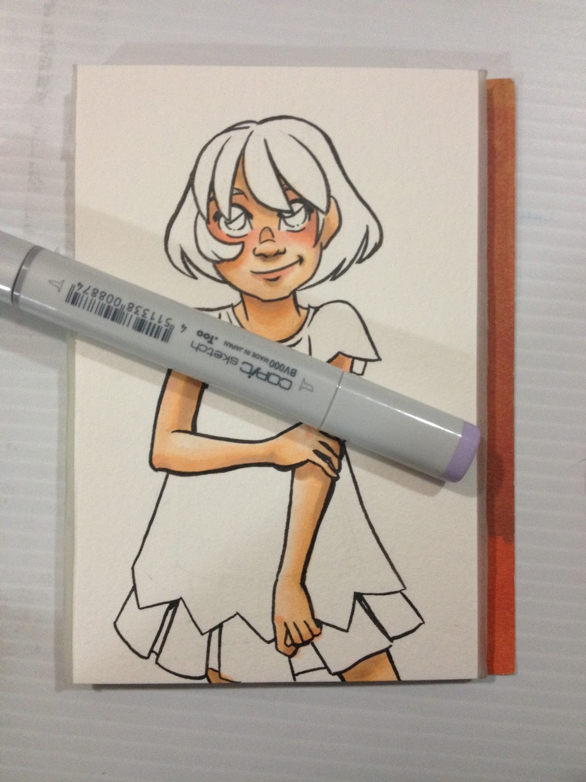
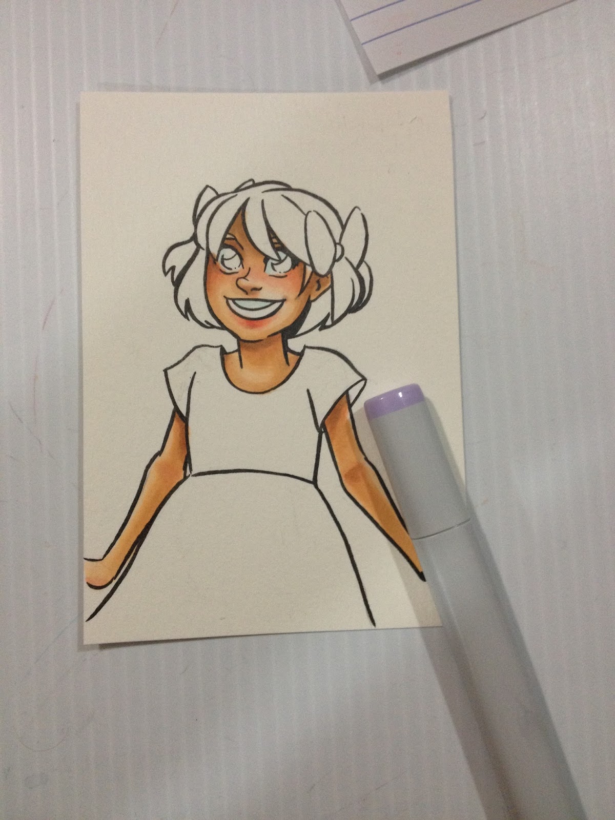
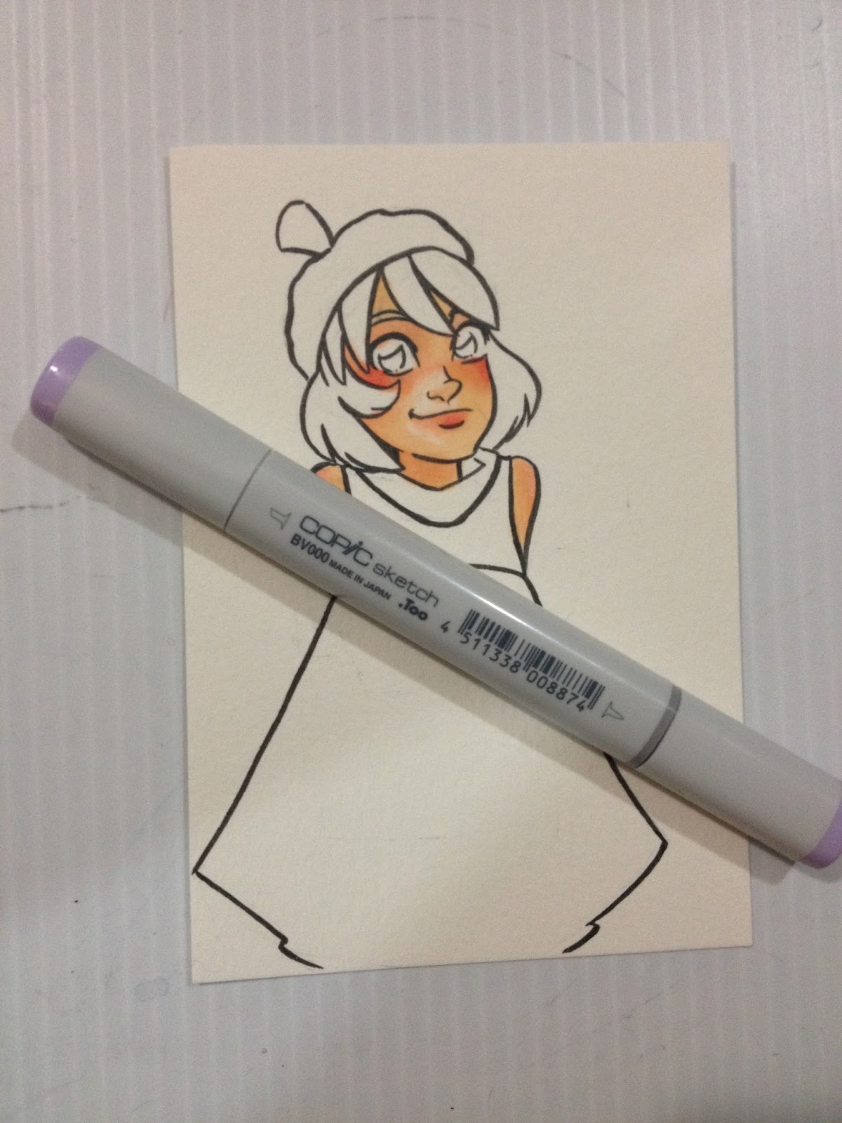
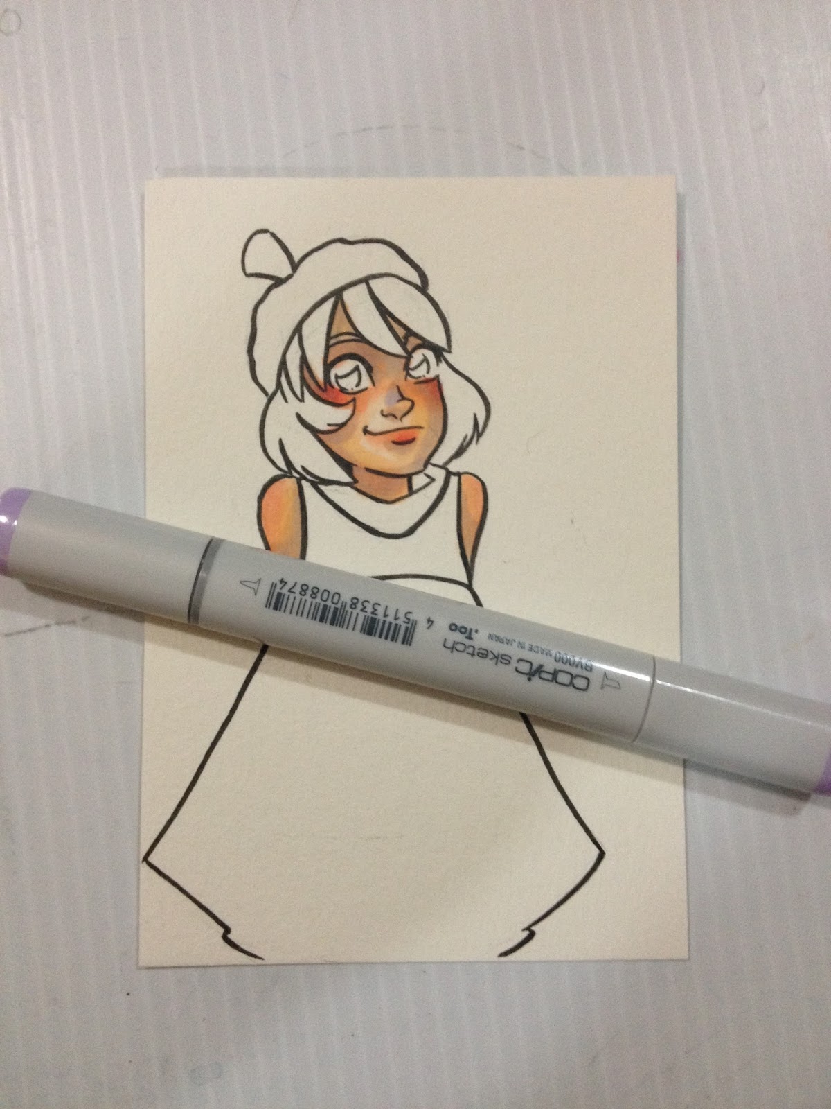
BVOOO-Iridescent Mauve is a great color to use to cool down hot shadows. If you find you've applied too much, you can use E21 or E51 to reduce the shadows a bit.


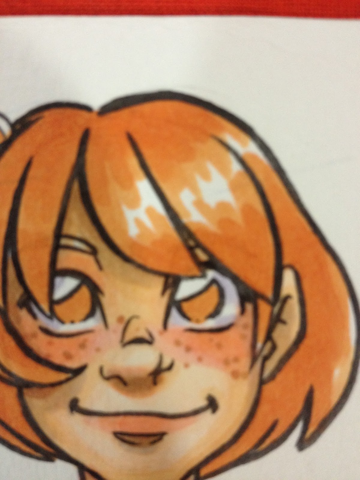
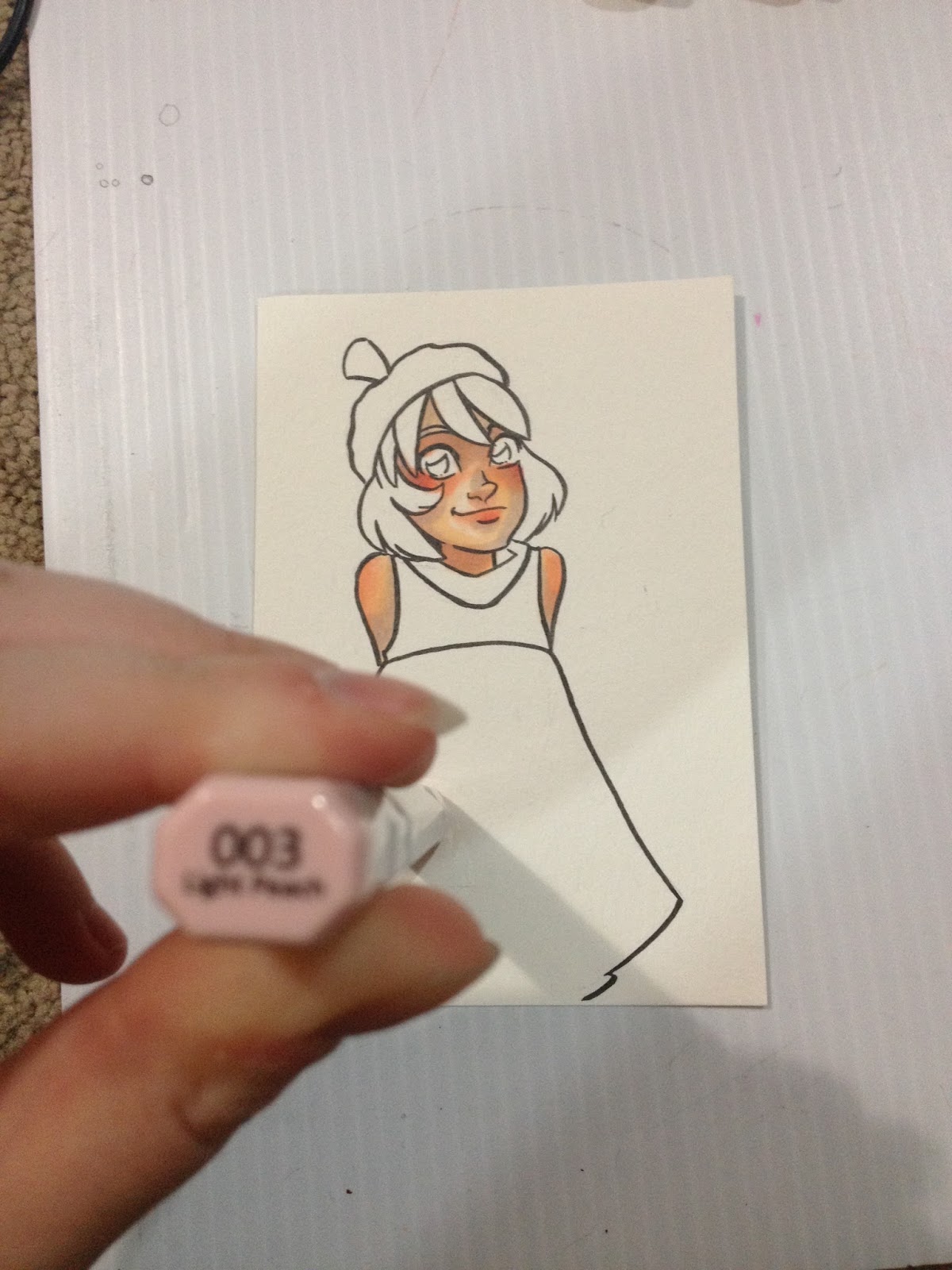
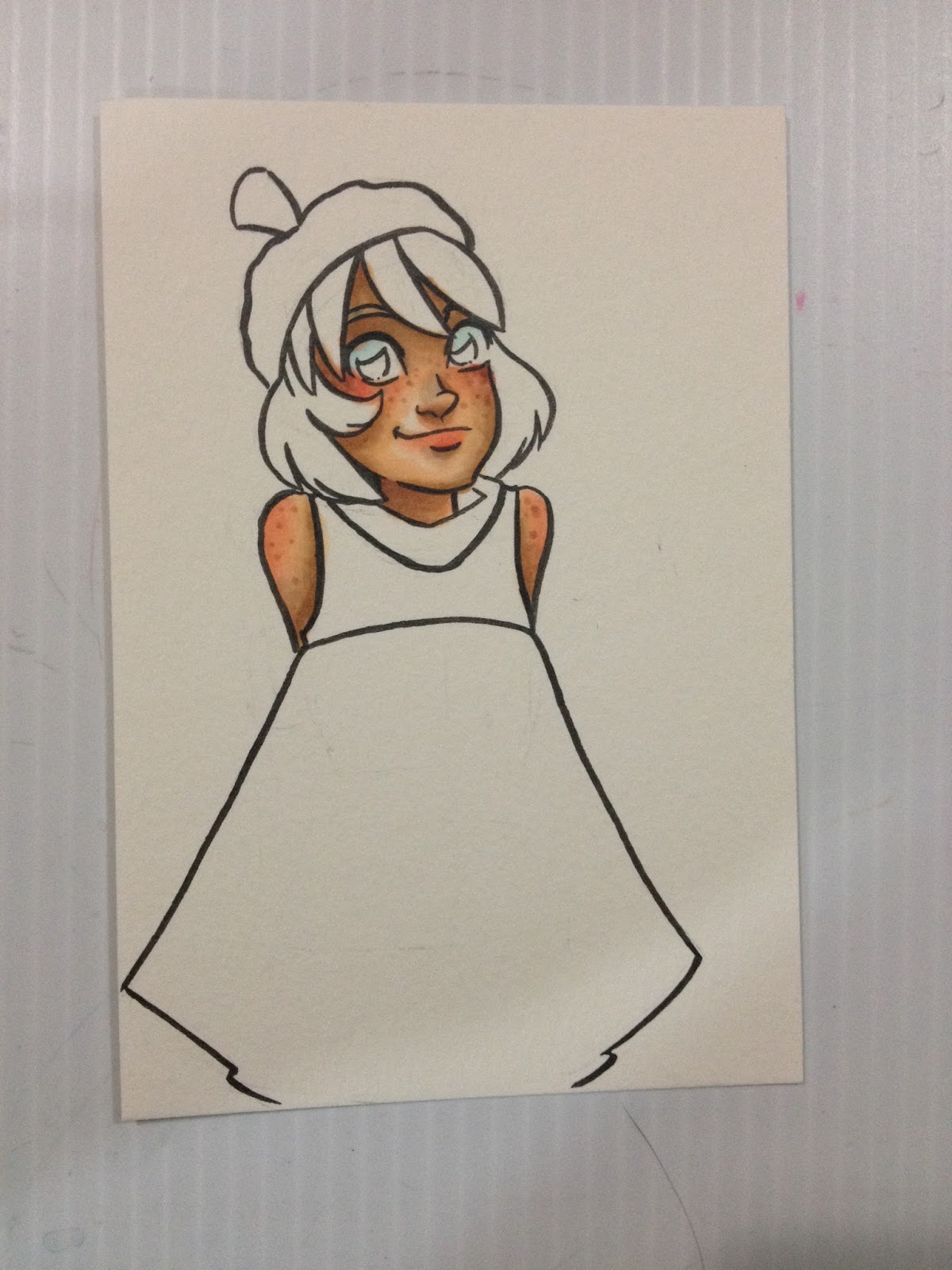
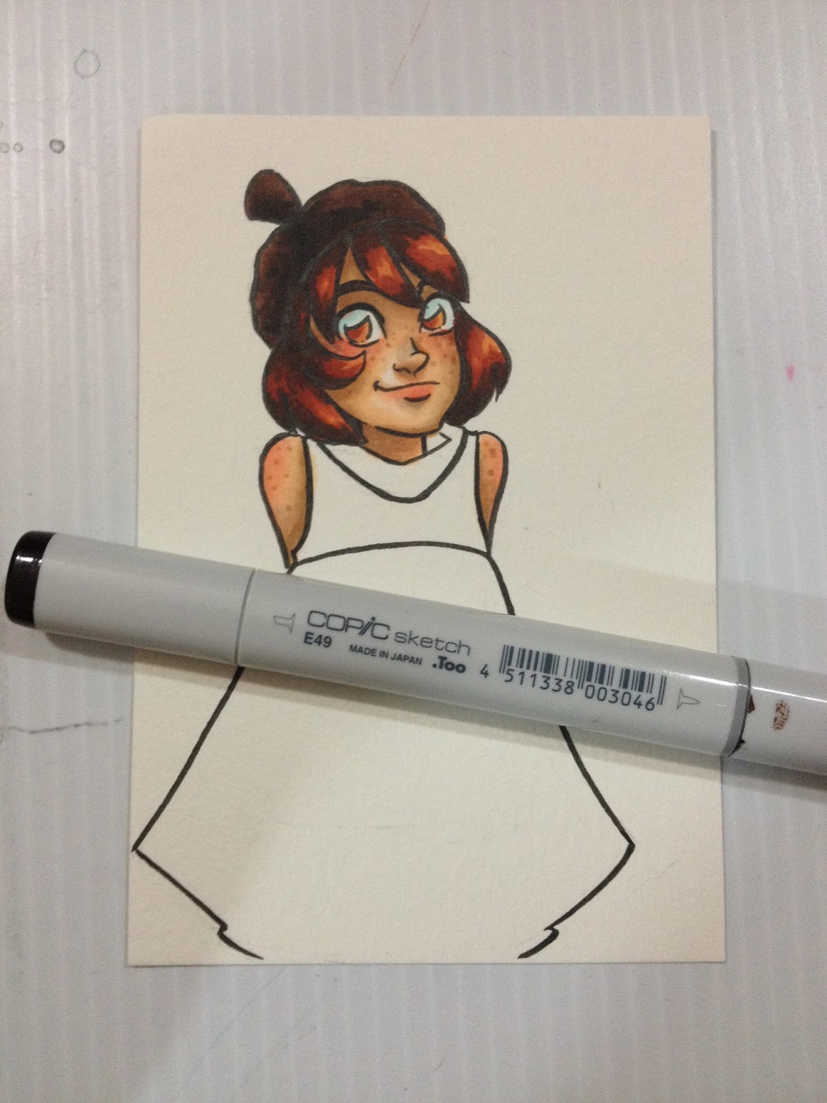
For freckles, I apply E34- Orientale along the bridge of Kara's nose, her cheeks, her shoulders and the outside of her neck, arms, and legs. For small pictures like this one, try to vary the size of your freckle dots. FOr larger ones, try to vary not only the size, but the shape. I like to apply another layer of freckles with E13- Suntan, and I add a few lonely specks with E23- Hazelnut, as freckles can vary slightly in color.
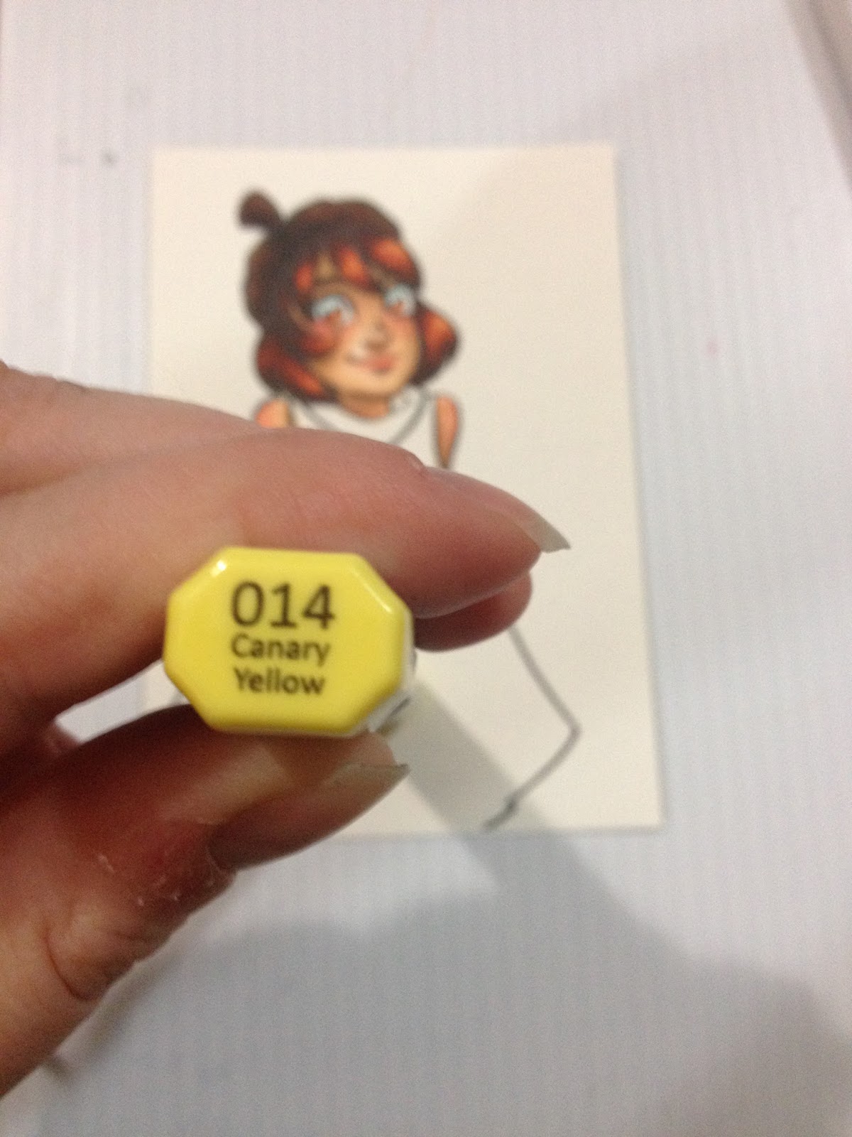
To see this completed image, keep an eye out for an upcoming post about using Distress Markers' Picket Fence as an opaque white accent!
My Favorite Colors for Darker Skintones
Skin


If you're interested in how I render darker skintones, check out my step by step process for Naomi in my Walmart Art Supply Review of Pacon marker paper.
Using Copic Markers on Cold Press Watercolor Paper
You don't need to use high end watercolor paper for Copics, in fact, cheaper is sometimes better! I'm using Canson XL watercolor paper, which is 160lb wood pulp, mould made paper with a very low tooth. It's a thirsty paper, so it'll drain your markers, but you can achieve lovely blends, and it's very forgiving. This sort of paper is fantastic if you want to do mixed media applications with your markers as it works well with watercolor markers, waterbased markers, watercolors, watercolor pencils, and even colored pencils.


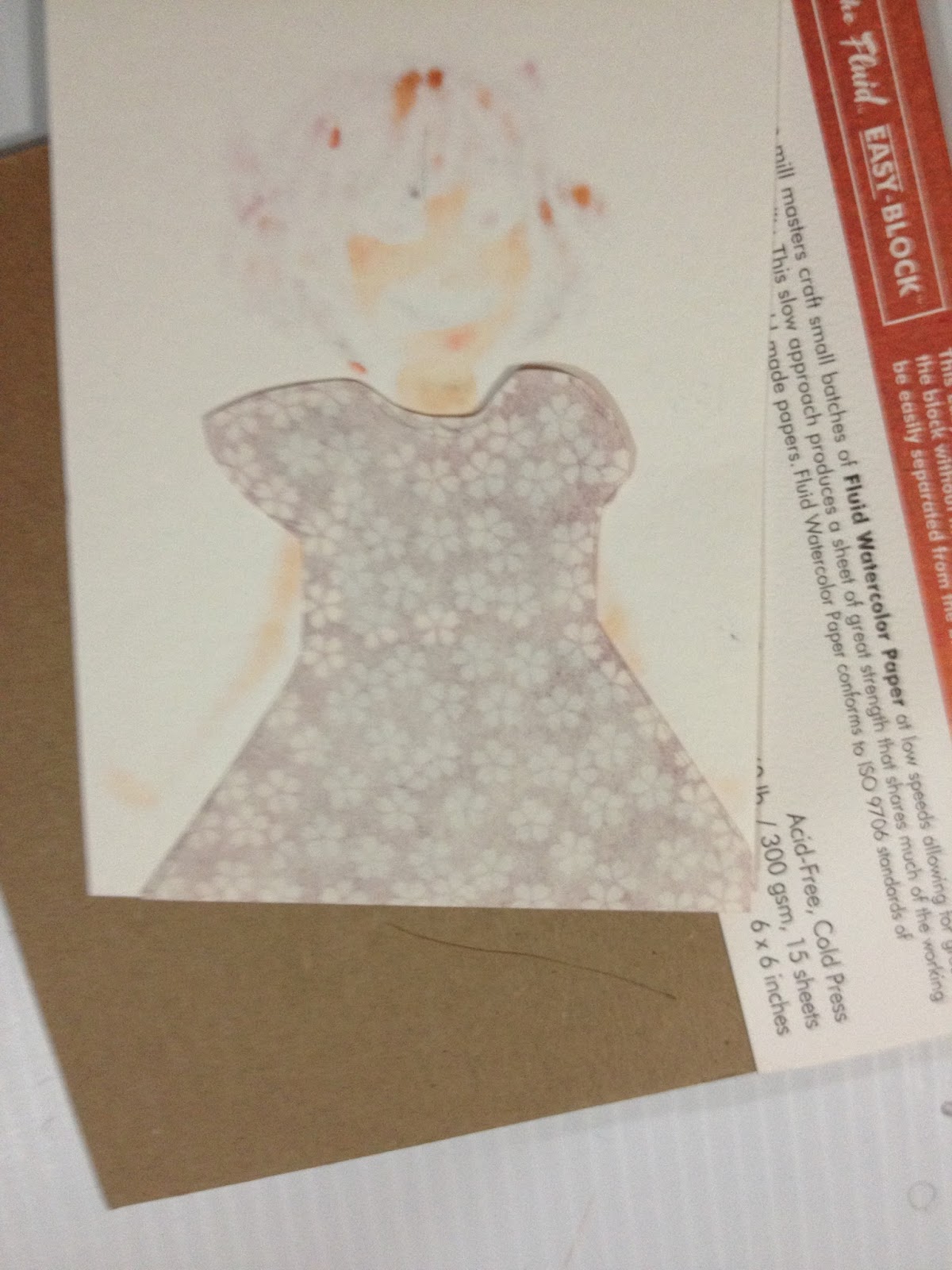
Using Decorative Paper as a Cute Accent
Another way you can stretch your marker collection is to purchase packs of decorative paper. You can often find scrapbook paper at Dollar stores, Walmart, and Michaels. I have a large collection of chiyogami origami paper that I like to use for illustration.


 When doing cut paper inserts, I think it's really important that you color the area you plan on removing anyway, so that there's an outline of color AND shadow.


You can also practice surface pattern design by extending the pattern of the paper onto your watercolor surface, to better blend the combination of the two, as I've done with the above four pieces. For these, I used a Recollections Opaque White Pen (those things are actually really great!) and a gold Sharpie (not archival, but my Signos keep blocking up).
I plan on doing many more posts on using alcohol based markers in the future, and hope to have some videos coming up, so keep watching, and please, send in your questions and comments!
Copics are a bit of a fetish for many illustrators, particularly illustrators who have been strongly influenced by anime and manga, but they aren't the end all be all of alcohol based markers. I've written about several other brands over the years, and while I have a sizable collection of Copic sketch markers, I also have Shin Han Twin Touch markers, Blick Studio Brush markers, and several Prismacolors. Many marker brands are intermixable- so long as you're buying alcohol based markers, not water or xylene based, your markers will more or less work together.
Most artists who use Copics and other alcohol based markers for illustration prefer brush tipped markers like Copic Sketch and Ciao, Prismacolor Premier, Letraset Flex, and Blick Studio Brush markers. While you CAN use bullet nib alcohol based markers, those make it a lot harder to get even coverage, and it takes a lot longer to color. Cheaper marker brands, like Finecolour, Artist's Loft, and Hobby Lobby's alcohol based markers only come with a bullet nib option, and may be so annoying to use that you feel alcohol based markers aren't for you. Before you fully decide, I recommend you pick up a few brush tipped alcohol based markers in the same color family (like three Prismacolor Premier markers in the green family) and play around with those on nice cardstock before you fully decide to give up on alcohol based markers.
A general rule of thumb is cheaper brands, like Finecolour or even Blick Studio Brush, will have less color saturation in the dyes used for markers. Saturation can be built up by layering, but they will never be as saturated as Copic or Prismacolor inks.
Prismacolor makes certain colors that Copic doesn't, so if you are having trouble finding a color in the Copic family, check Prismacolor. Prisma excels at bright, saturated colors- intense yellows, hot red violets, and fluorescents.
I recommend that you check out my Holiday Gift Guide on markers for the aspiring artist if you're looking for color suggestions and brand recommendations. I also have a video that features my three favorite non-Copic brands below.
3 Cheap Copic Marker Alternatives
But If You Have to Have Copics
Copic Ciaos are almost as good as Copic Sketches, and a couple bucks cheaper if you can find them in person! They're slightly smaller, so they hold less ink, but they're refillable and have the same Super Brush nibs as the Copic Sketch.
Focus on buying a set of Warm Grays and amassing a collection of skintones that work for the type of work you want to do.
Your markers can do double or even triple duty through layering! The first layer of a color is very light, and often a bit streaky, but the second and third are much darker and saturated. While you build up your marker collection, keep in mind that layering can make just a handful of markers work wonders.

Two layers of E97 have been applied to Kara's hair.
As you can see, the first layer is much lighter than the second.
While you're still building that collection, consider keeping your pieces as tonal studies, or tonal studies with a single color highlight. Colored paper, like Strathmore's Toned Tan and Toned Gray, give you an additional color- the color of the paper, and if you use white color pencil, that's two more colors.
Determining where your shadows go
I approach shadows in layers. I'll do a base of E000 all over the skin, then lay in basic shadows with E000. I usually apply blush after this stage, lately I really enjoy a combination of Blick's Shell Pink with Copic's Tea Rose after. Shell pink is a lighter pink, and the contrast isn't so harsh. The areas in which I apply shadow with E000 are shown below in the tonal studies.
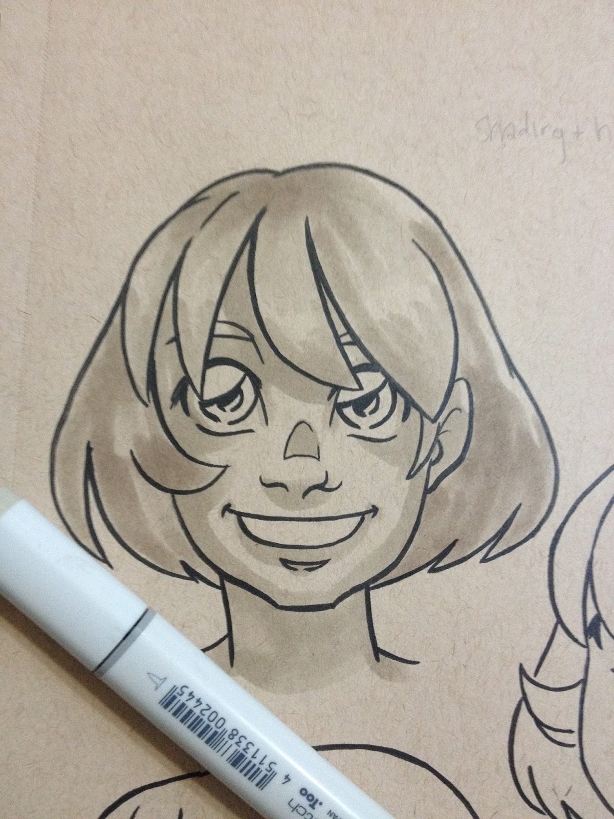
After I've applied my first round of shadows, and put in my initial applications of blush, I go in and intensify my shadows with E51, as demonstrated below with these tonal studies.
At this stage, I may add in shadows with E21, or I may put in my contrasting shadows with BV000 or BV31, depending on the image. The contrasting shadows should be applied sparingly, as they will REALLY gray out your skintone. I find they work best under bangs, inside ears, under chin, and where clothing casts shadow. If you apply a layer of E51 or E21 on top, it will warm the shadows up a little bit, but the cast shadows wont have a strong a delineation. I've demonstrated shadows put in by E21 or BV colors with the tonal study below.

For kicks and giggles, I used some opaque white media (Winsor & Newton white pigment marker) to add white highlights and make the tonal study pop.
You can use colored pencils and watercolors to stretch how far your markers go- once you've finished applying your marker color, you can add highlights, shadows, contrasting color, and details with color pencils and markers.
 |
| Example of a Copic study from reference. Mixed media |
If you really want to get better at using markers as an art medium, do studies. Do them in Copic, do them in Watercolor (many of the prinicpals of color application are the same), do them regularly from photographs and from life.
 |
| Example of using watercolors and pencil colors with Copics. Shade was added to the mushrooms using watercolor, as watercolor tones down Copic without making it muddy. After everything was dried, white color pencil, and white color pencil were used to add the white highlights on the red caps. |
I've found that it helps to make swatches of all the possible colors I want to use and then cross out the ones that won't work, and number the ones I think will in order that I want to use them. If you find yourself using the same colors over and over (for skintones, hair, animals), consider tacking up those cheat sheets for quick reference. Although Copic's color chips are A LOT more reliable than most other brands, they are still not 100% accurate, so it's wise to make swatches before you risk ruining something, especially if you're trying to do color matching.
Step 1: Select all possible markers you might use for the piece.
Step 2: Swatch on the paper, and make sure you note the color numbers.
Step 3: Number in order of use.
Step 4: Final Piece
Selecting A Paper for Your Illustration
You want something thick that will absorb your ink. Good choices include uncoated cardstock, wood pulp based watercolor paper (both hot and cold press, but not rough), and smooth or plate bristol. These dense fibers will hold the ink and keep it wet longer, so this is perfect if you really like smooth blends, but tends to make fine details feather out. This tutorial uses watercolor paper that has been inked with a Copic-proof Sailor Mitsuo Aida. This is my preferred paper for marker illustrations.
For clean, sharp changes in color, few layers, striking special effects with alcohol and colorless blender:
Coated, thinner, non-absorbive papers like tracing paper, Copic papers, and marker paper in general are good if you want more dramatic transitions, or enjoy putting in lots of fine detail, or like special effects. On coated papers, the ink will sit on top of the paper rather than soaking in, and is easily reactivated. Tracing paper is also a very viable option, especially if you want to add color to a sketch, but can't add it to the original due to correction fluid, or sketching materials.
My favorite colors for Caucasian skin:
E000
E51
E21
E34
E13
Freckles:
E34
E13
E23
You can get these colors below, and help support this blog!
How I Color Kara's Skin
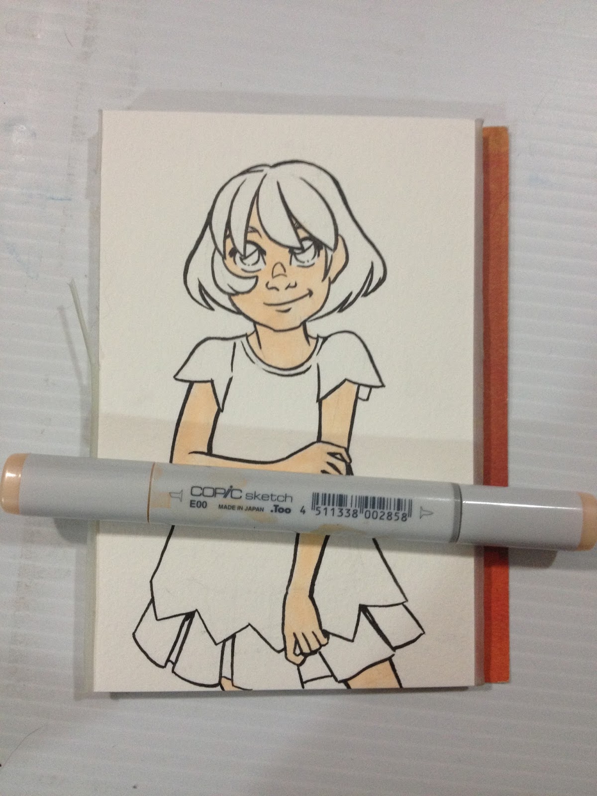
I apply an all over base layer of E00- Milky White. Aplying a base layer means that your subsequent layers won't have streaking, because you've primed the paper. It also helps facilitate blending between all layers. If you prefer strong, sharp shadows, allow your paper to dry for 5-10 minutes before applying that color.
I mark in my first round of shadows in E00 as well- from under the bangs to the bump in Kara's nose, the sides of her face, under her lip, her neck, upper arms (in this example), lower side of Kara's forearms, tops of leg.
I use Blick Studio's Shell Pink to block in blush- Kara's cheeks and across the bridge of her nose, above her eyelids, the underside of her nose, lips, under her chin, elbows, knuckles. I darken this up a bit with Copic's E93- Tea Rose.
Once I've made the skin's shadows as dark as I can with the E00, I switch to E51- Milky White, to continue to darken my shadows. I mostly just intensify the shadows already put down with E00.
As you can see, underneath Kara's nose, the Mitsuo Aida ink smeared a bit. This is unusual- I was very careful to erase all graphite, I allowed the ink to cure fully overnight, and my marker is nice and juicy.
The last color I really rely on for skin toned shadows is E21- Baby Skin Pink, and I use it fairly sparingly- where direct shadows would be cast. In this example, under Kara's chin, under her bangs, under her skirt and her sleeves.

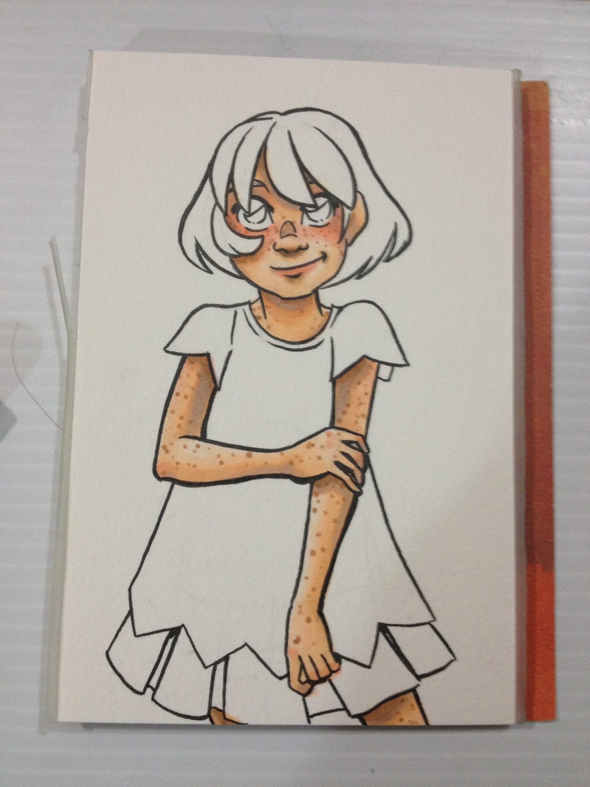
For freckles, I apply E34- Orientale along the bridge of Kara's nose, her cheeks, her shoulders and the outside of her neck, arms, and legs. For small pictures like this one, try to vary the size of your freckle dots. FOr larger ones, try to vary not only the size, but the shape. I like to apply another layer of freckles with E13- Suntan, and I add a few lonely specks with E23- Hazelnut, as freckles can vary slightly in color.
To see this completed image, keep an eye out for an upcoming post about using Distress Markers' Picket Fence as an opaque white accent!
My Favorite Colors for Darker Skintones
Blush
- E04, Applied to cheeks, eyelids, bottom of nose, lips, chin, reapplied after E23 application
- R85- Trying to get a darker blush that shows up well without displacing original color of skin
Skin
- E71- All over base
- E27- Majority of face, blocking in shadow
- E23- Blend between E71 and E 27
- E37 Blending out E27, but sits on top of paper and doesn't blend well
- E34- Used to blend out the E37 that just sat on paper surface, lighten up some areas a little bit


If you're interested in how I render darker skintones, check out my step by step process for Naomi in my Walmart Art Supply Review of Pacon marker paper.
Using Copic Markers on Cold Press Watercolor Paper
You don't need to use high end watercolor paper for Copics, in fact, cheaper is sometimes better! I'm using Canson XL watercolor paper, which is 160lb wood pulp, mould made paper with a very low tooth. It's a thirsty paper, so it'll drain your markers, but you can achieve lovely blends, and it's very forgiving. This sort of paper is fantastic if you want to do mixed media applications with your markers as it works well with watercolor markers, waterbased markers, watercolors, watercolor pencils, and even colored pencils.


Using Decorative Paper as a Cute Accent
Another way you can stretch your marker collection is to purchase packs of decorative paper. You can often find scrapbook paper at Dollar stores, Walmart, and Michaels. I have a large collection of chiyogami origami paper that I like to use for illustration.

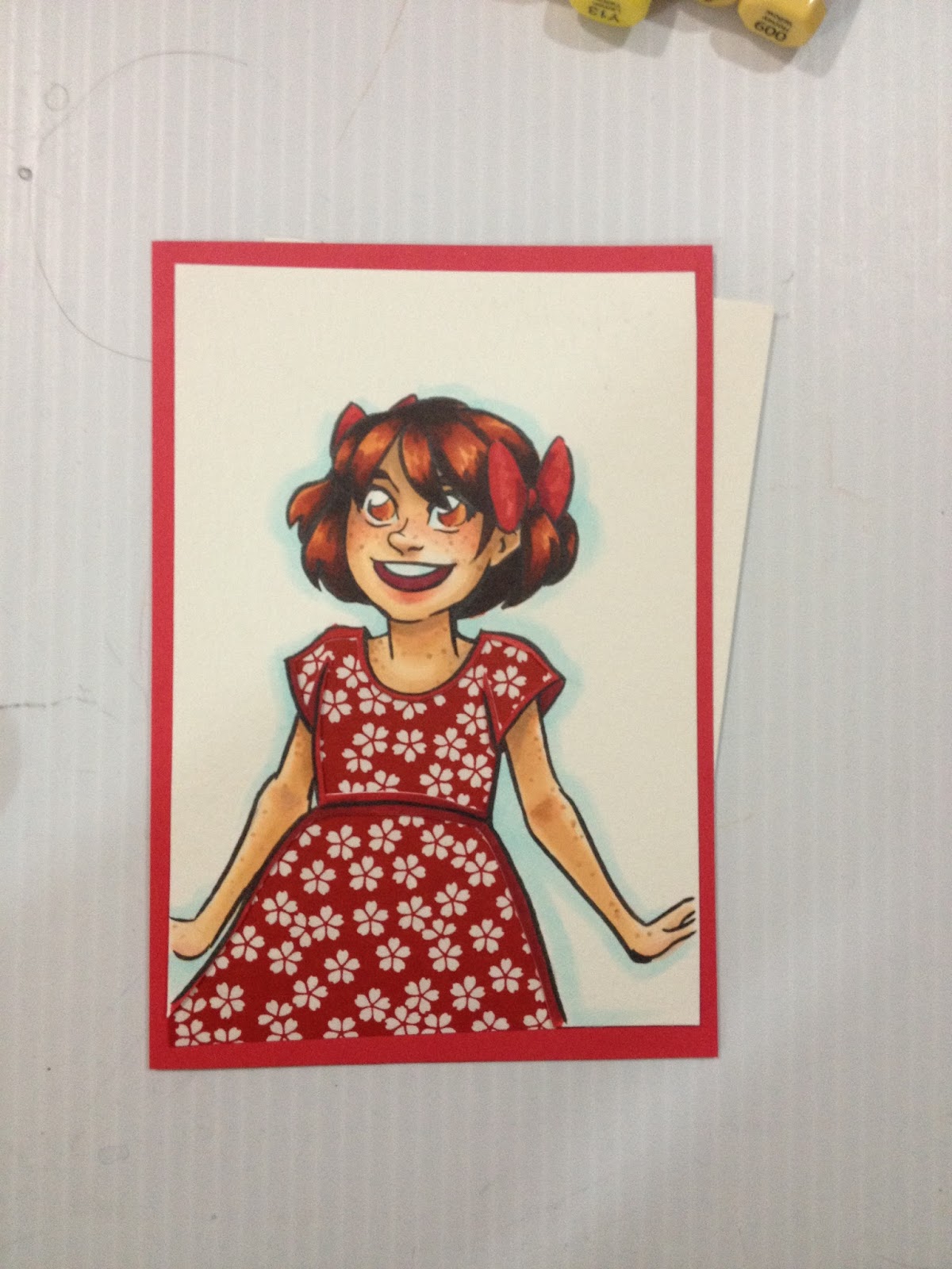


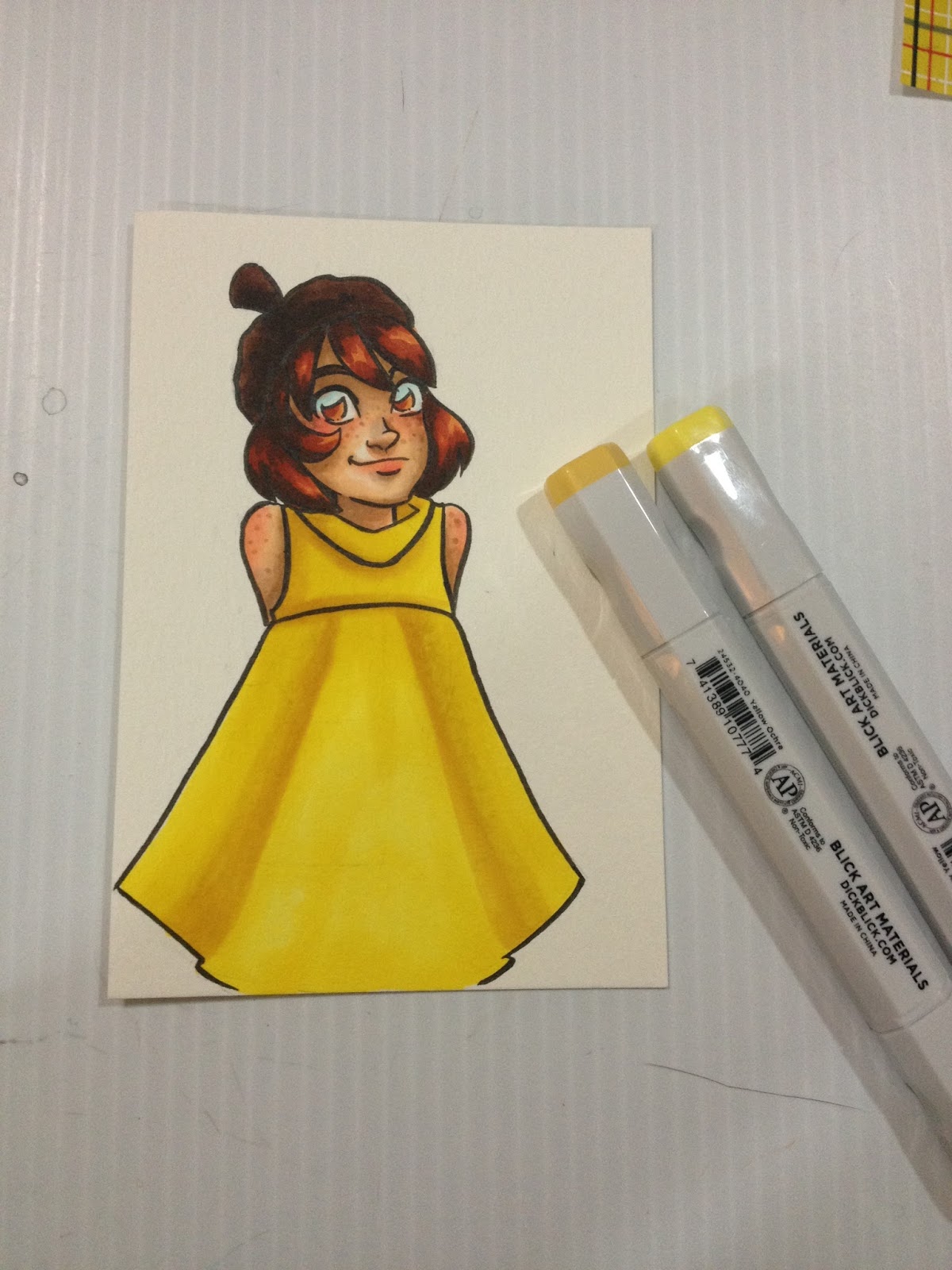
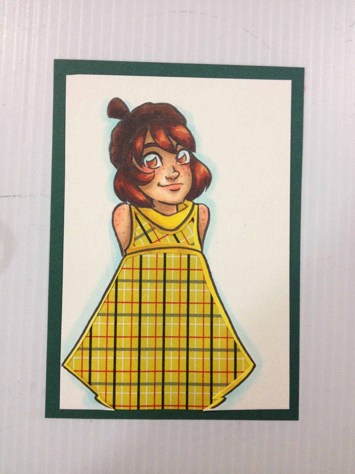
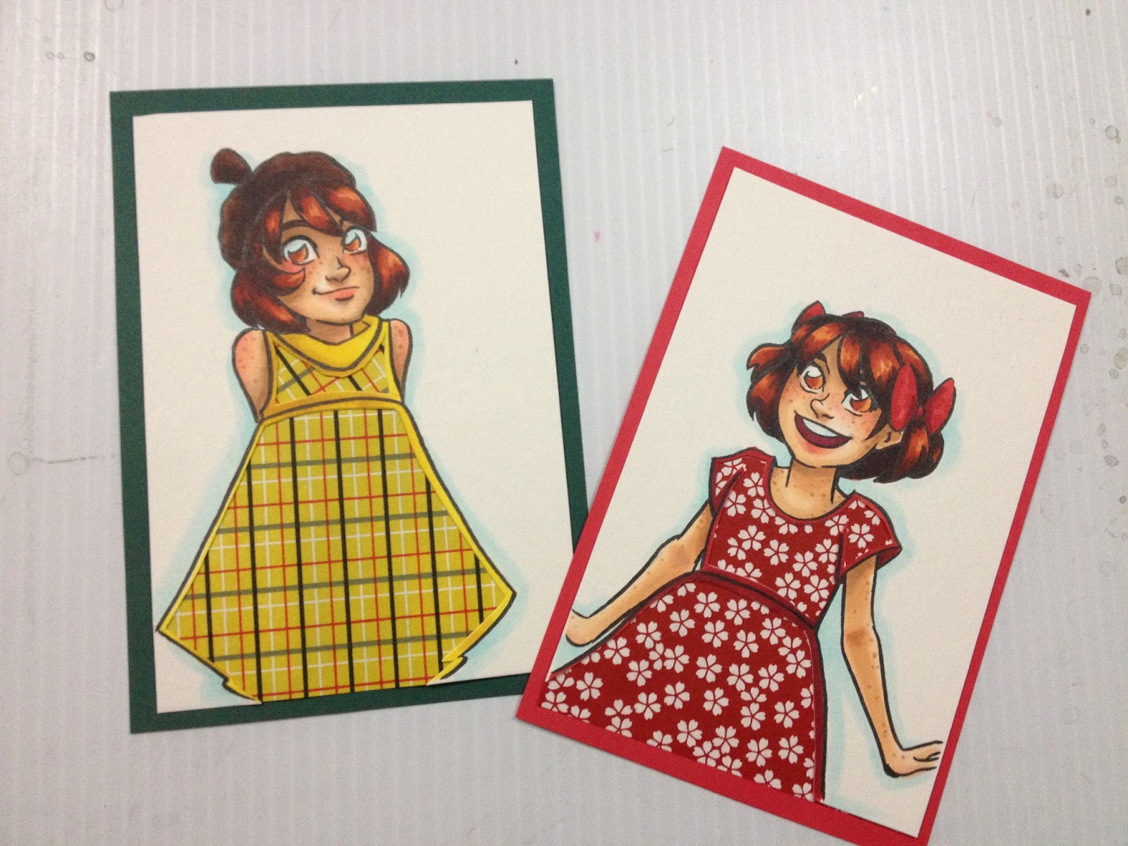


You can also practice surface pattern design by extending the pattern of the paper onto your watercolor surface, to better blend the combination of the two, as I've done with the above four pieces. For these, I used a Recollections Opaque White Pen (those things are actually really great!) and a gold Sharpie (not archival, but my Signos keep blocking up).
I plan on doing many more posts on using alcohol based markers in the future, and hope to have some videos coming up, so keep watching, and please, send in your questions and comments!
Comments
Post a Comment