Guest Post: Mharz and The Angel With Black Wings
If there’s anything I’ve learned in the years of doing art is that it’s an endless experimentation. It’s fascinating how each artists have their own sets of principles, and methods of doing things. Today, I am happy to share my very own comic making process in this nice little blog post!
First off, a bit about me. Hello my name is Mharz and I’ve been doing webcomics since 2014. Prior to that, I was working in animation industry since 2012. I never went to art school and all the knowledge I have in art is based from my experience working in the industry and self-learning. I currently have three webcomics: The Angel with Black Wings, about the friendship between a human boy and a guardian angel; CHAMPS, about an MMA’s conquest in the octagon and in love; and The Robonoid Fan about different kinds of adults. In addition to that, I’m also currently doing pencils and inks for Donathin Frye’s I, Necromancer. I know… I have many stuffs to do.
I also do occasional drawing tips based on my experience in animation. Anyway, enough about the intros and let’s get this process started. I kinda have like a wide variety of methods but for the sake of simplicity, I’m just gonna discuss my comic making process for The Angel with Black Wings.
For starters, I’m gonna divide my process into three phases. This is something I have adopted in animation production: Pre-production, Production, and Post-production.
Pre-production
This is the phase where I outline, plot and thumbnail the story. I usually do it every 5 chapters so I won’t burn out. This is the most gruelling phase for me and really requires me to use too much mental power.
I am very old-fashioned when it comes to writing and I really prefer to write in paper because (1) I get tired easily if I sit in the computer for too long and I can write on paper while I’m lying down, (2) I can bring them anywhere in case I unexpectedly thought of something, I can write it without the need of gadgets and internet.
I like to keep notebooks for writing. 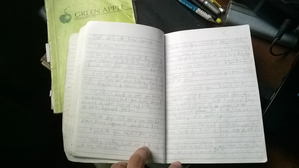
Here’s one of the pages of the notebook scanned. I deeply apologize for my ugly handwriting. XD
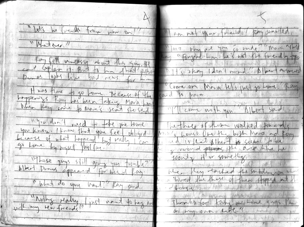
As you can see, I prefer writing in prose than in script format. In this stage, I’m not thinking of the panelling and layout just yet and my priority is to just the story flow. I’m not that smart to think of so many things at once. So I continue this process until I finished five chapters before proceeding to the next stage which is thumbnails/storyboard.
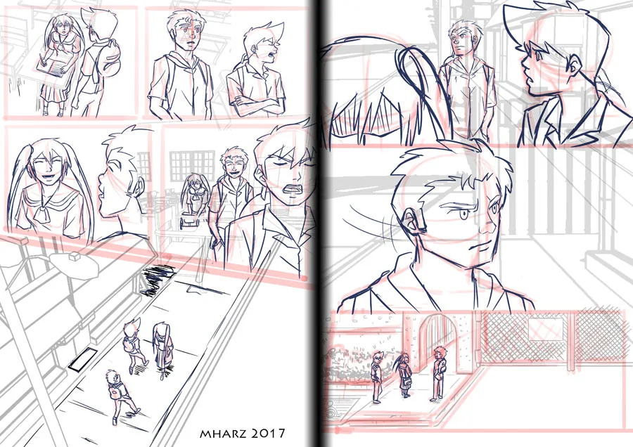
Now this is the stage where I start to think of the story as a bunch of comic page. My thumbnails are really just a bunch of very rough sketches. I also do this in paper as well.
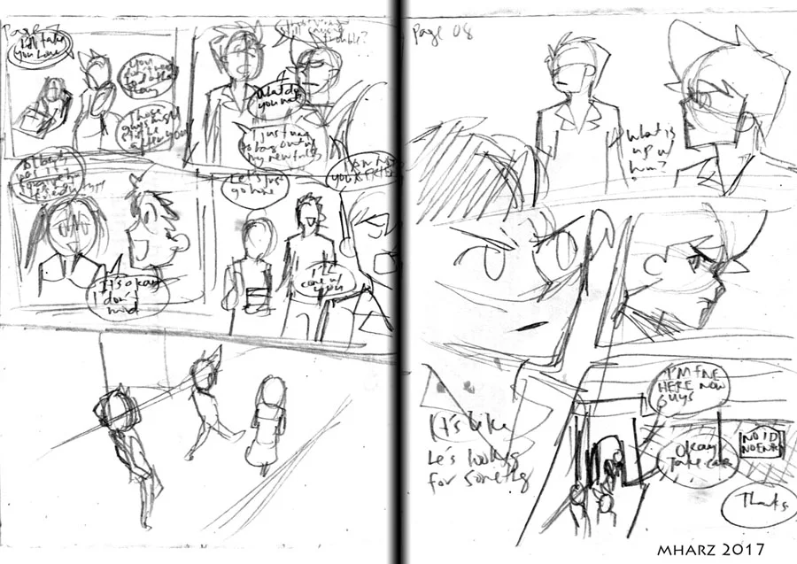
I have worse sketches than this, trust me. I usually sketch very fast on this stage so that the momentum and my brain won’t slow down. Bear in mind that this layout is not set in stone. If I thought of something better in the production phase, I’d definitely roll with that but it’s nice to have a clear visual reference. Once all five chapters has been fully thumbnailed, it’s finally time to move onto the next phase.
Production
This is the phase where I really draw the actual page. It’s finally time to go digital because I prefer drawing in digital. Before I start of the actual page, I do the backgrounds first. I’d be the first one to admit to you that I don’t have much patience in drawing backgrounds especially buildings so to make up for it, I’m gonna use my good ‘ol buddy, Sketchup.
For those who don’t know, Sketchup is a 3D software. It’s definitely not the best software around but I chose it since it’s fairly easy to use (at least I think so) and also the myriad of 3D models they have in 3D Warehouse. (I usually just use the most generic looking 3D models)
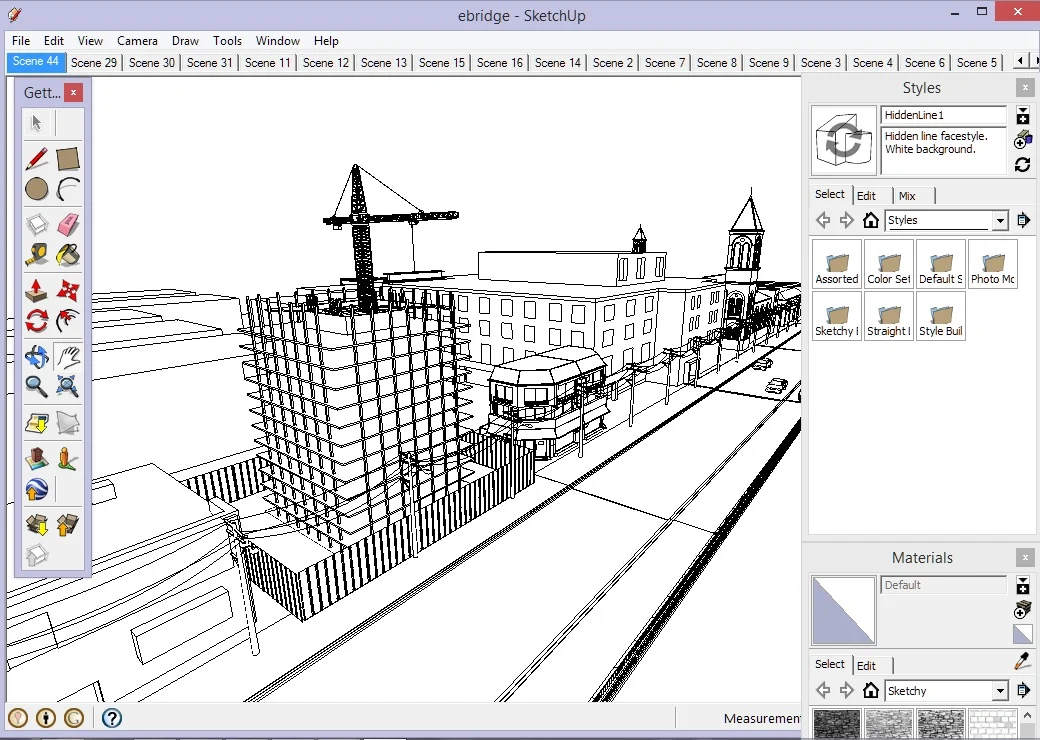
This particular model was made from putting some buildings I made in addition to pre-made models I’ve downloaded from 3D warehouse. Another reason why I prefer using sketchup is they have this setting where the models look like they’re 2D lineart as seen on the image and I’m heavily utilizing it. This way, I don’t really have to spend extra time lining them. (Of course, I can make it work since my setting is modern day.)
Anyway, let’s just save the more elaborate explanation and usage of sketchup in a future post. We still have a lot to discuss.
After I picked the proper camera angle for the background, I exported it as a PNG image and now it’s time to move onto the pencils (but I really just refer to it as rough sketches).
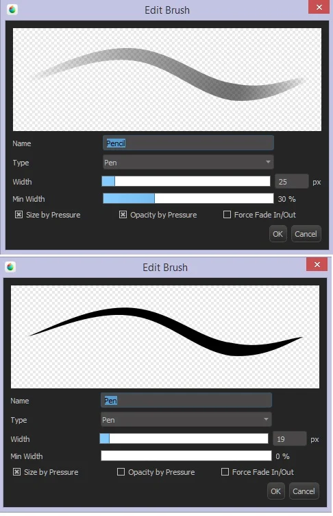
I’m using Medibang Paint Pro for pencils and inks, by the way. I just love how tight their stabilizers are and it’s really compatible with my hand strokes. The paper size I use is A4 at 300 dpi since it’s a pretty common size in our country and it’s also directly proportional to my intended print size which is A5.
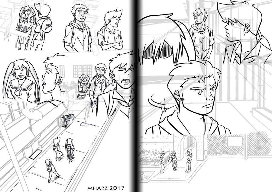
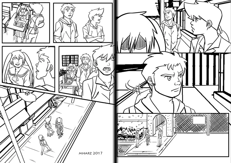
With my thumbnails as the guide, I do these in order, sketch the panel border, paste the backgrounds, draw the character constructions.

I usually add the background first so that I can figure out the perspective and the footing of the characters. I do the construction in red lines out of habit really. If you look back from the thumbnails you’ll notice that I made some last minute changes at the layout of the last panel. I realized that one panel where Ray is looking from behind is pretty redundant so I took it down and shifted the bottom panel to be wide.
Now I can add details or what we normally call in our studio, tiedown.
I use blue lines for this one so I won’t confuse it with grays/black once I start to ink. These steps are very essential to me since I tend to flop at drawing without doing these steps. Once I finished the tiedown I can finally do inks/clean-up.
I almost forgot to mention what brushes I used for the sketches. Anyway, I only use Medibang’s default pencil and pen brush. No fancy mumbo jumbo there.
Now using the same pen brush, I ink the lovely characters.
I’m gonna clean the backgrounds and remove the lines that should be obscured in a bit but first I’d like to point out something first: When I do the inks I make sure that the lines are aliased. For those who aren’t familiar of the term, aliasing is the sharpness of the lines. Example:
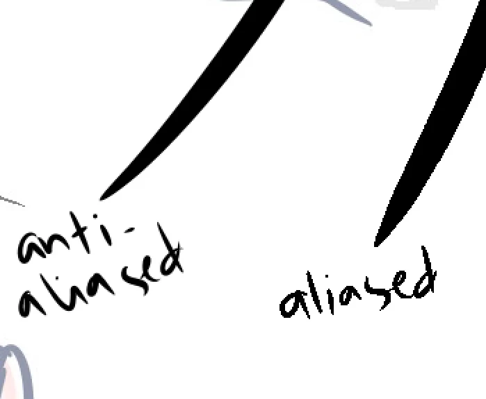
Aliased lines are more sharp and crisp albeit jagged when zoomed-in. The reason I picked aliased lines when inking is because it’s easier and cleaner to flat than anti-aliased lines and since I’m drawing at 300 dpi, the jaggedness won’t be that obvious. Although I wouldn’t recommend it for lower resolution drawings.
After all the inking. Medibang’s job is now complete and I’m gonna jump onto a different software: Good ‘ol Photoshop. I actually just use an old CS2 because I can’t afford the monthly ones.
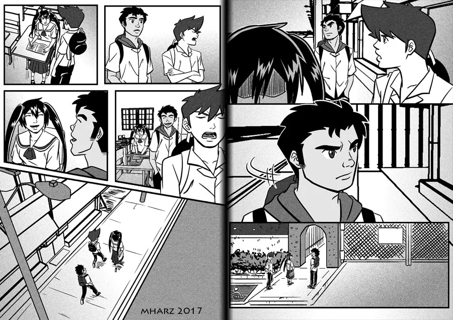
I added the legit panel borders and cleaned up the unnecessary lines and viola! Time for do the tones!
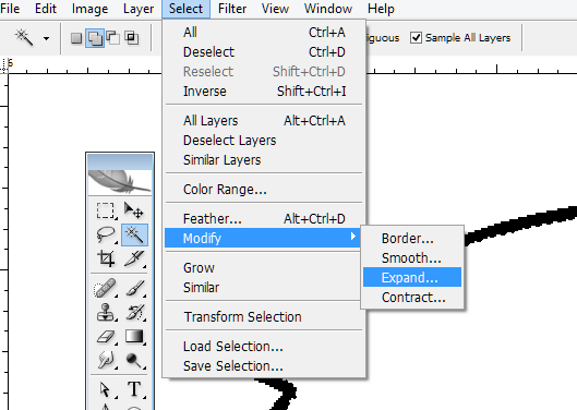
When adding the tones, I select the areas I want to fill with the magic wand tool. Here’s my settings:
I expand the selection so the grays will go slightly underneath the lines and won’t have those strange white gaps. To do this go to Select > Modify > Expand like shown in the image:
After some doohickey, the grays and blacks are now added. I separated the grays and black in different layers. I just use gradients on the backgrounds. I only add shading if I need to emphasize on the lighting so most of the time I only have flat and gradients on the pages. I also added some noise filter so the tones have texture and not plain looking.
This is the end of the production stage.
Post-production
In animation, this is the phase where you add fancy effects. In my comic making process, in addition to adding effects when necessary, this is where I do the texts as well as the final edits. I added the text first before adding the speech bubbles. If you can afford it, get an editor. Sadly I’m a poor sap who can’t afford to pay people so I have to do everything on my own.

And it’s done! I usually export it for print size before shrinking it down for web uploads. I usually do Production and Post-production in a per page basis. With this method I can finish 1-2 pages per day. The 3D backgrounds helped considerably in my production time. This is the method that worked for me but like I said at first, every artists have their own set of principles that worked for them so be sure to constantly experiment to find what’s suitable for you!
If you have any questions, or want to stay updated if I posted new artworks or drawing tips, you can follow me in these parts of the internet:
Comments
Post a Comment